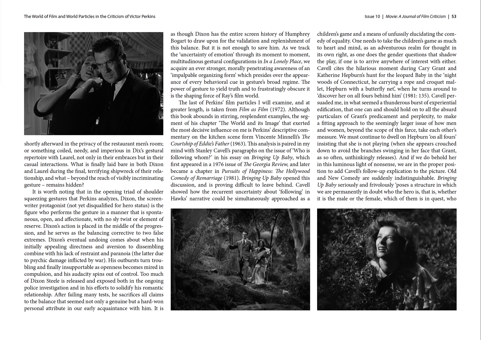
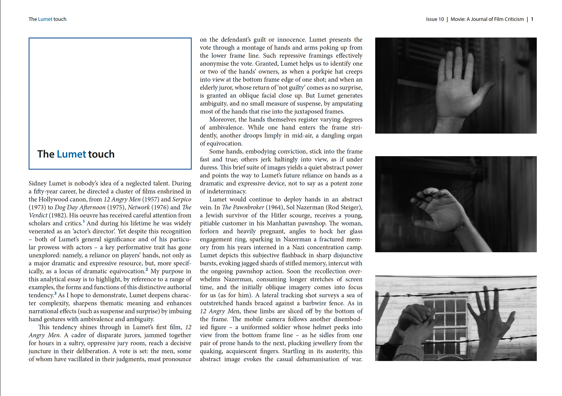
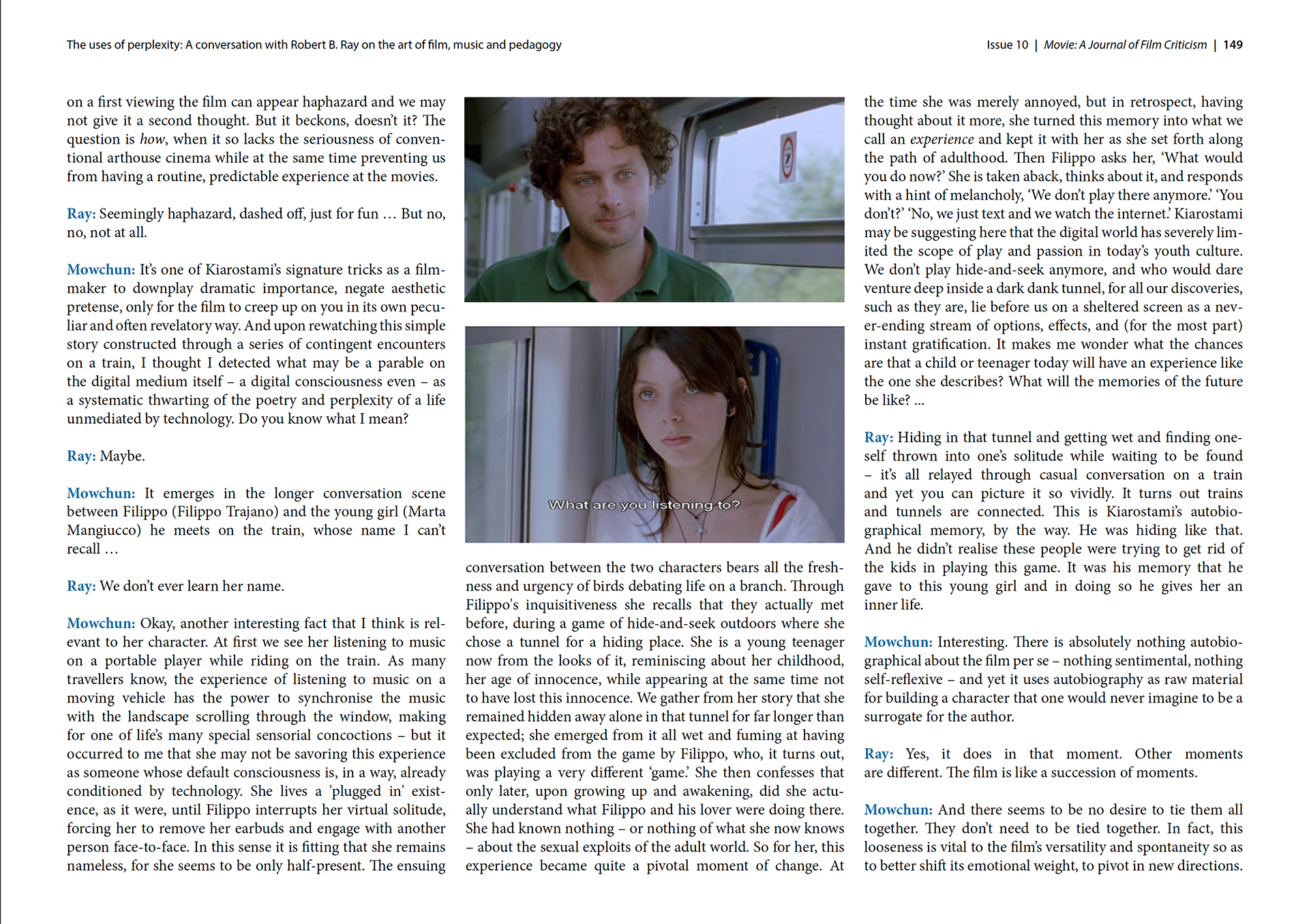
This was perhaps one of my greatest challenges in my design career, stepping away from having initial creative control, instead continuing on from somebody else, in a series of designs that already have strict design rules and branding in place that had to be followed and respected. Movie: A Journal of Film Criticism, is an online magazine in. Classic design style inspired by prestigious movie critics from the 1960’s. This project allowed to develop my editorial layout skills with frequent meetings with the client discussing even the slightest on changes. They were very protective of the design rules established years prior, and I respected their dedication to the project and did everything that I could in order to guarantee the high standard was upheld. Above are some examples of how the pages looked. Every page featured text in 3 columns, often accompanied by images. Every page of text had to be displayed in a perfectly set square (besides a couple exceptions including contents pages.). These chapters consist of interviews, reports and video podcasts, with content changing at authors request at any time. It was a new and exciting project, and one im particularly proud of. Please click the link below to see the whole issue.


