In one of my final projects as an undergraduate student, we were tasked with creating a newspaper and brand of our choosing, with a working template that can be used for future issues. The outcome was, 'Fest: the home of Reading festival news'. When I visited Reading festival in 2022, It was easy to miss out on so much of the action occurring and would find times of the day where I had not much to do but wait for artists to come on stage. I felt that this newspaper could fill that hole, informing guests of music news, timetables and camp news including crime.
The newspaper was judged on how it handled content and how the template can adjust and fit to alternative content, so some of the text repeats itself in places.

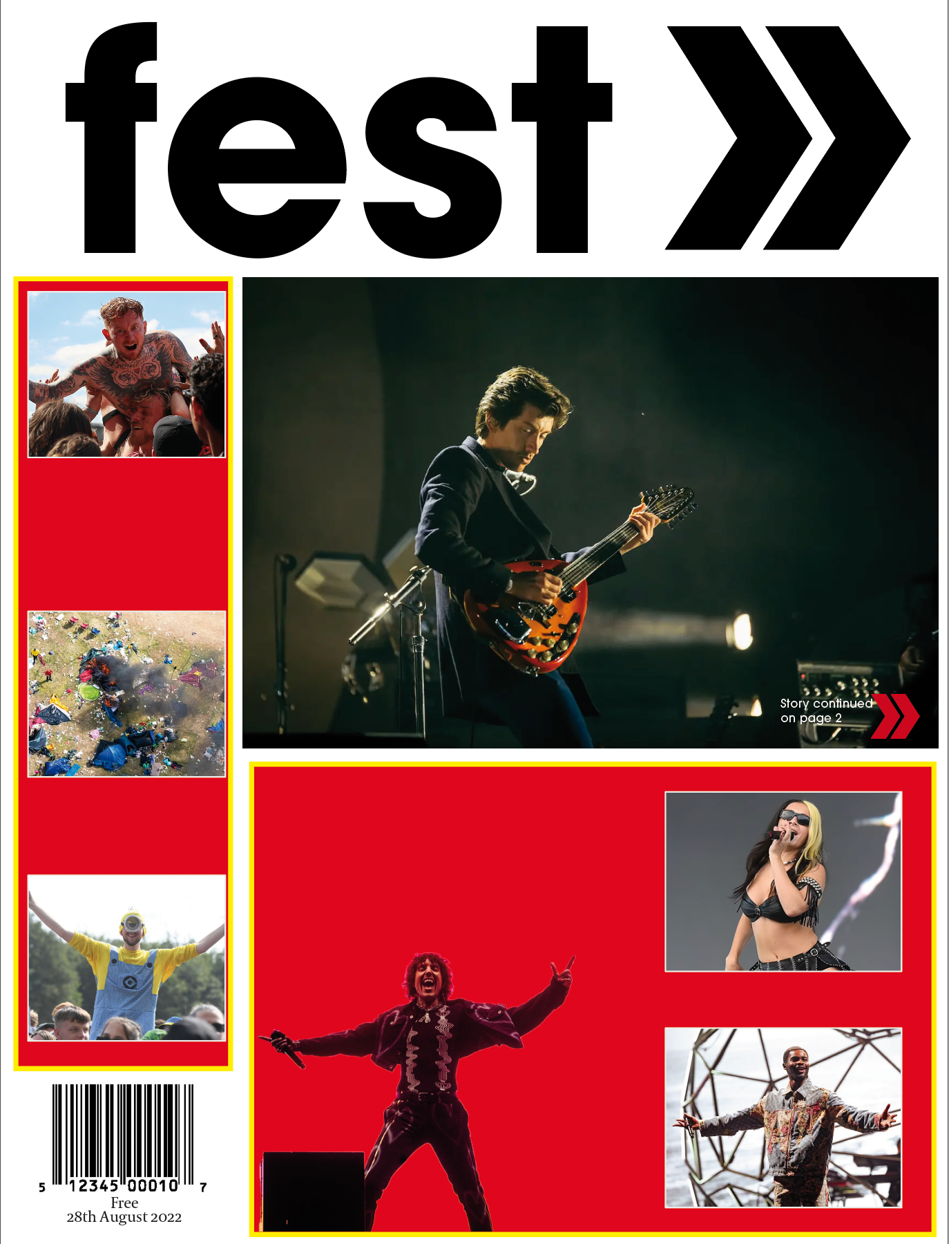
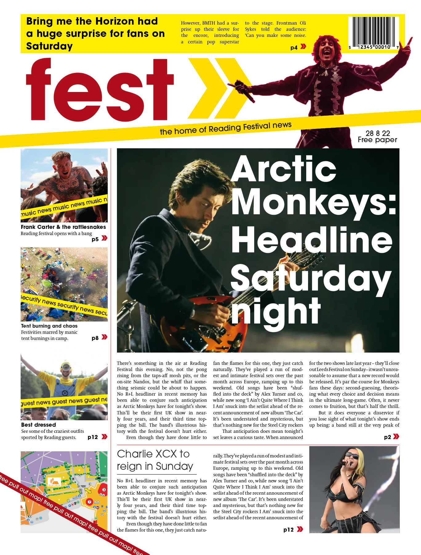
The front page.

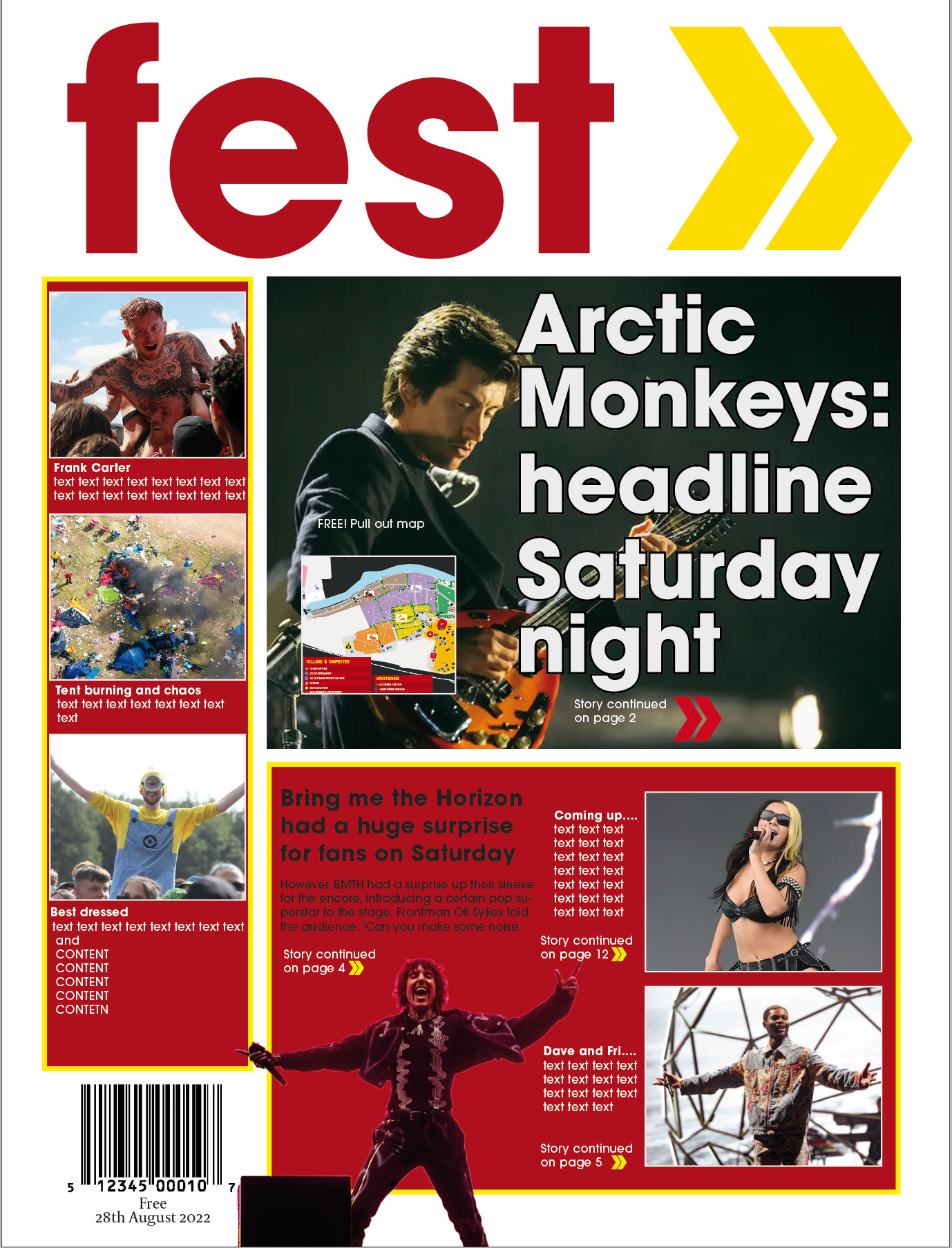
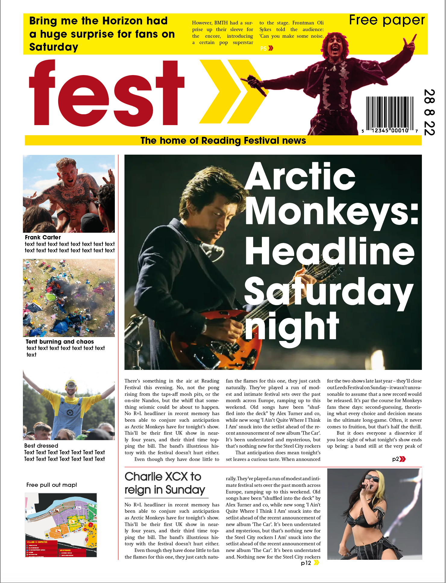
Above are earlier versions of the front page. Originally, I took a more tabloid approach with content in boxes, the masthead also sat much larger across almost the upper 1/4 of the page. As more content was inserted, I realised I did mot have enough space for the text, entry points and subtitles I wanted. The use of banners became more prevalent across this page too as the brand came together, this helped structure the page and subsequently the rest of the newspaper.

The final masthead, incorporating the Reading festival arrow icon as recognisable imagery as well as a navigational tool inside the newspaper. This went through lots of slight alterations, but the constant was typeface, similar to that of the official one, but not the same, so that the branding remains my own. I avoided the use of capitals in the end, favouring lower caps, the big block letters seemed too static for a hyper festival.
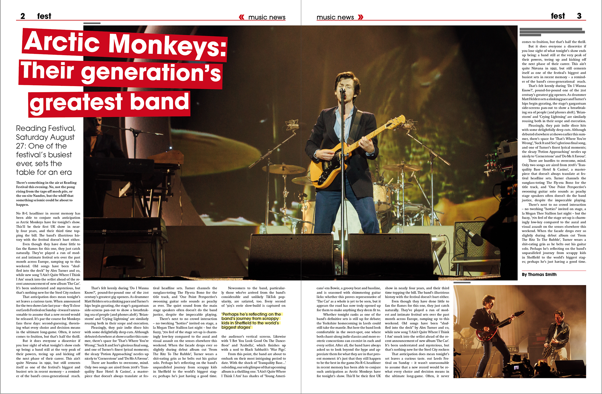
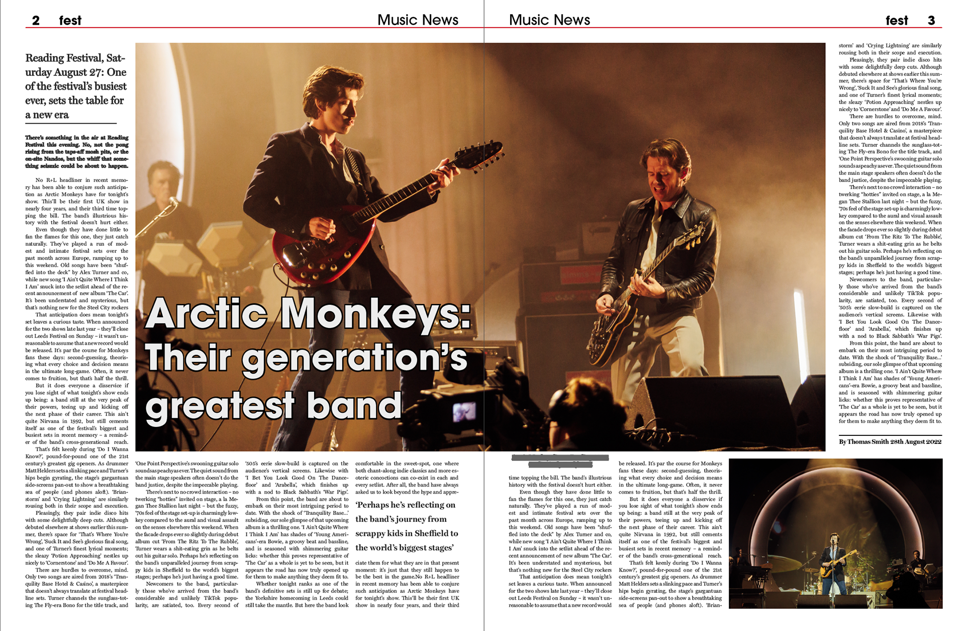
The first spread with the main article, following on from the front page, focusing on the Artic Monkeys headlining Saturday nights show. This spread features a pull quote, image credits, captions and shows how headers were handled using the arrows to highlight what section of the newspaper the reader is looking at. Author names only feature on long articles and have a rule above them, the same size and colour rule that would be used throughout the whole paper to break up the text. The titles for the bigger articles use banners behind the text, at multiple different angles to reflect some of the original branding for the festival. These help highlight some important text throughout the paper such as the pulled quotes which also feature the same feature at a reduced opacity. These banners colours will depend in which area of the paper the reader is looking at, switching between red and yellow, the official Reading Festival colour palette.
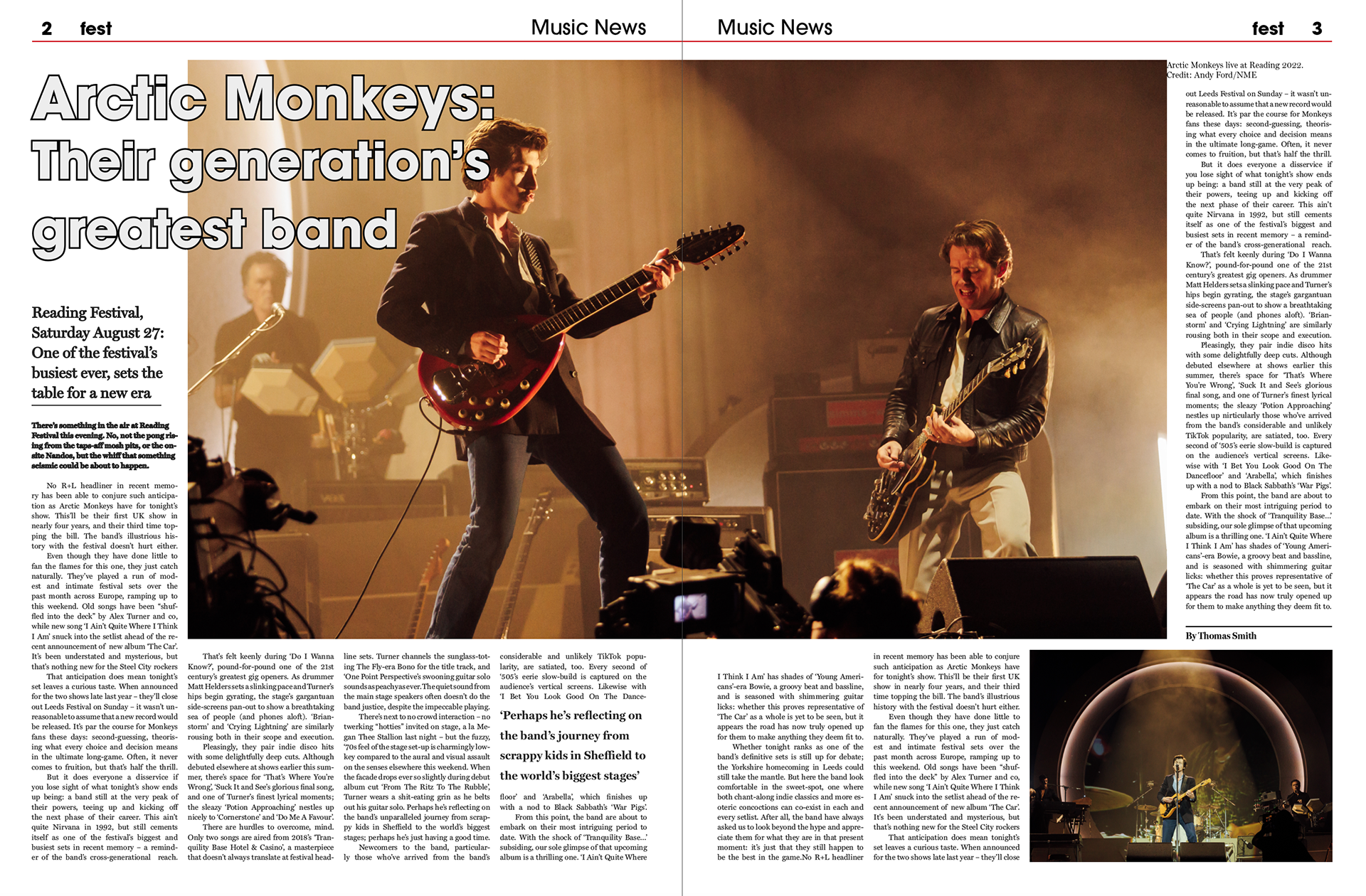
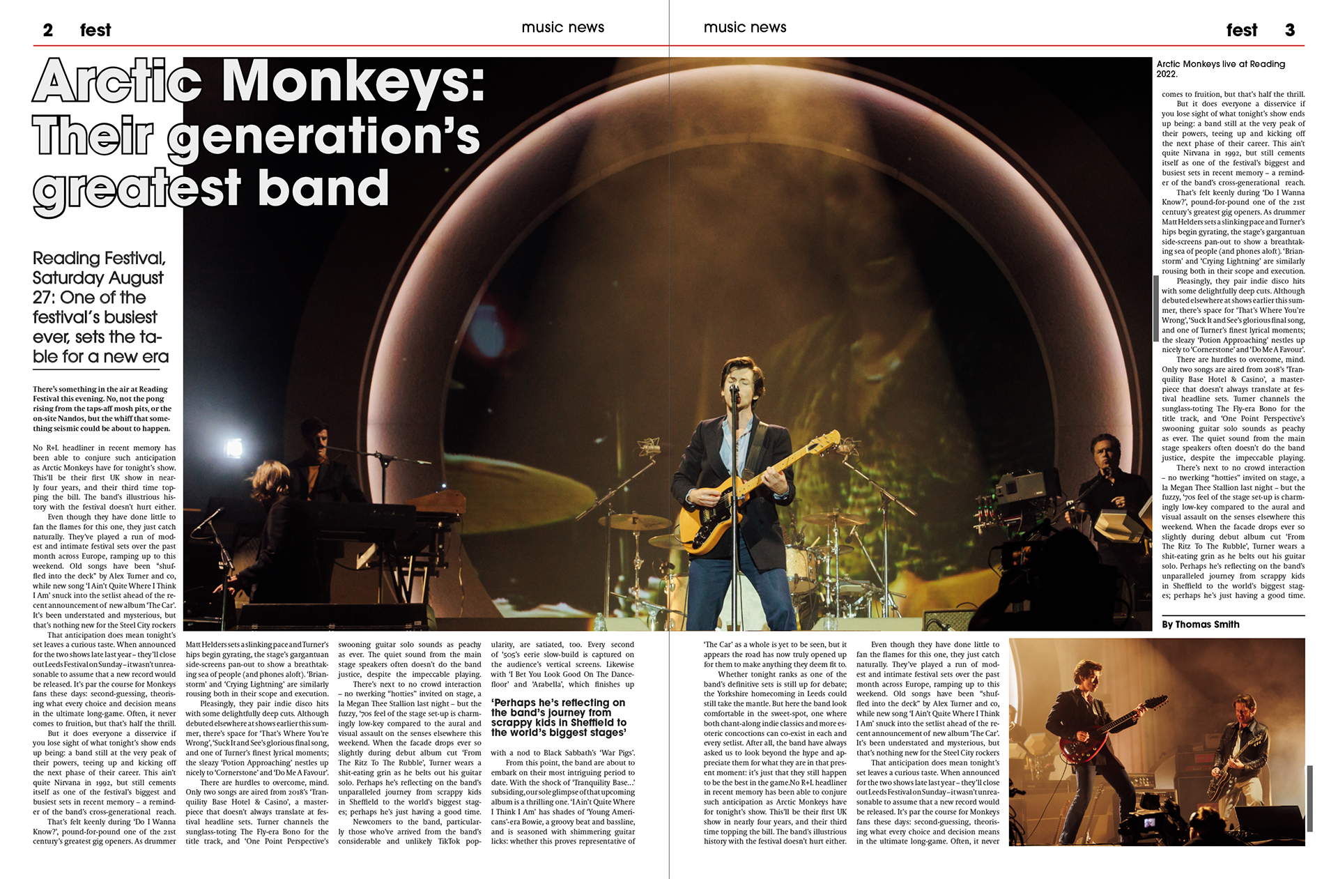
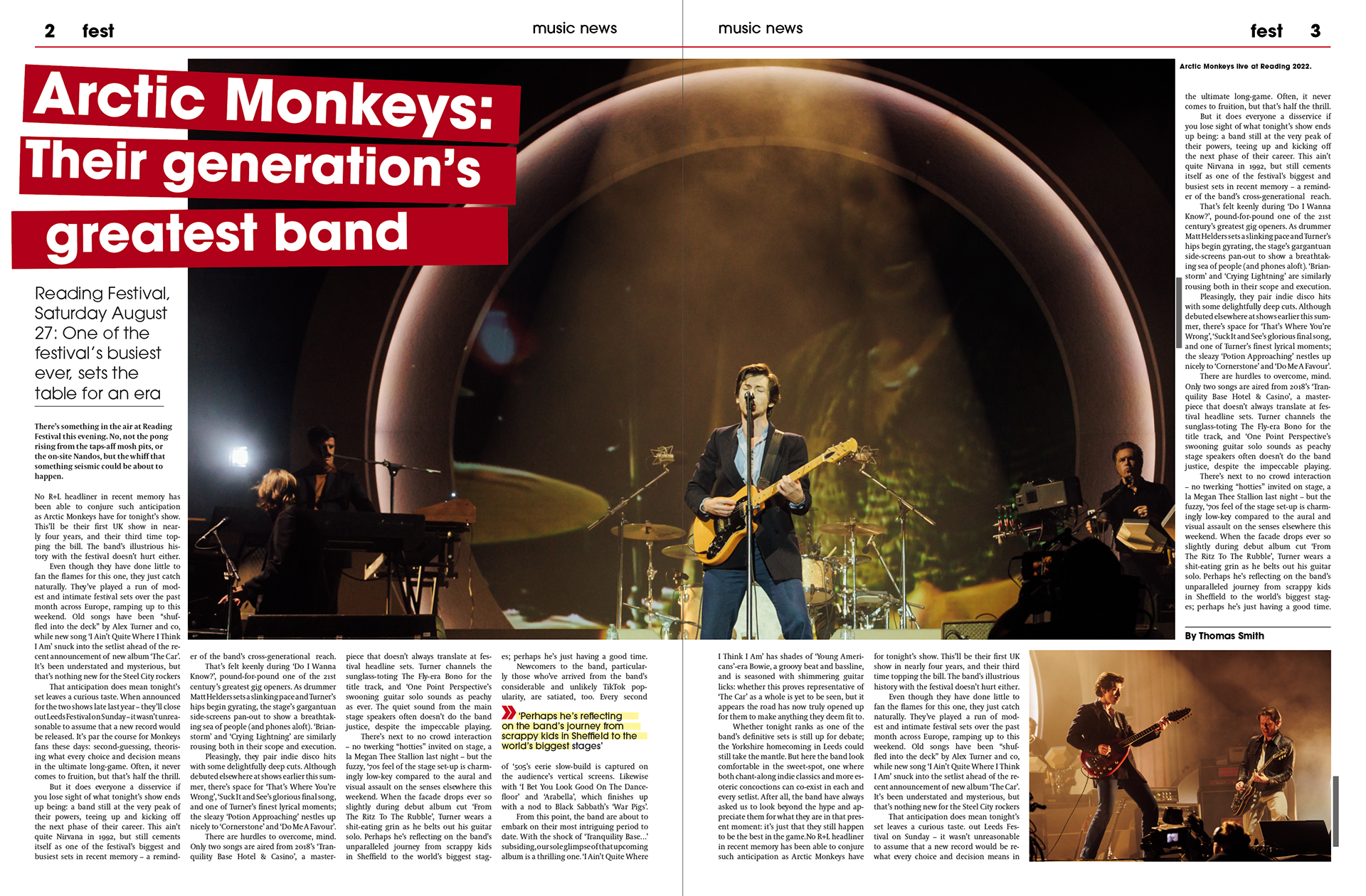
These images show the development of this main article spread, before the banners were used to highlight the titles. The text I used still resembled a very tabloid approach, with bold outline text. For the most part this article remained similar from the start besides the image and how they are cropped, these images act more as a record of how the brand evolved.

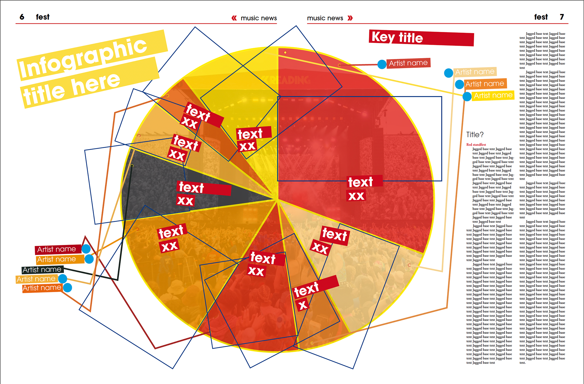
An infographic spread showing the number of guest artists per music genre attending the festival.

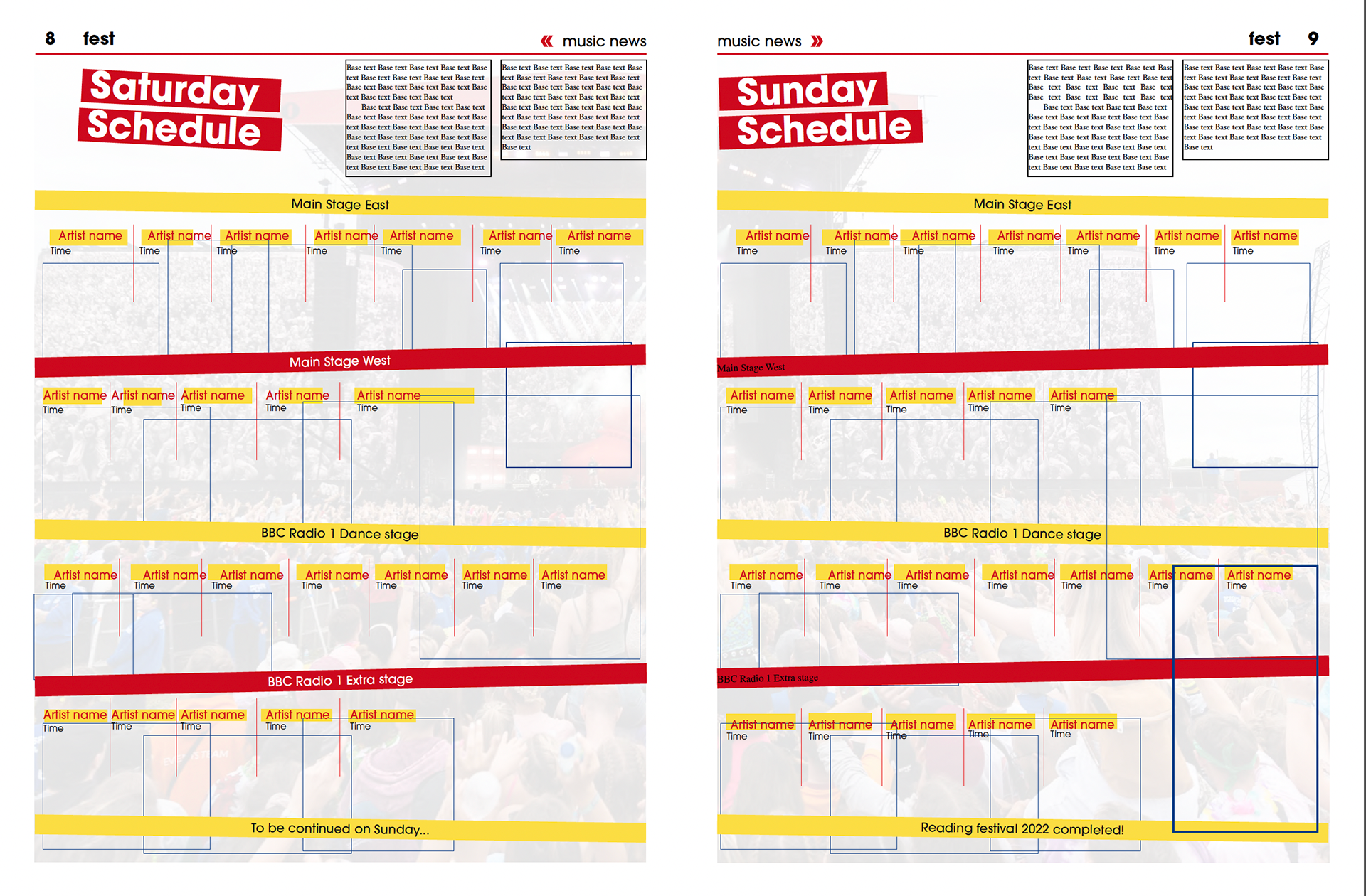
A pull out schedule for guests with no phone or internet to see what time their favourite artists will be performing with images for some. The banners from the front page are used here to establish which stage the acts will be on. 
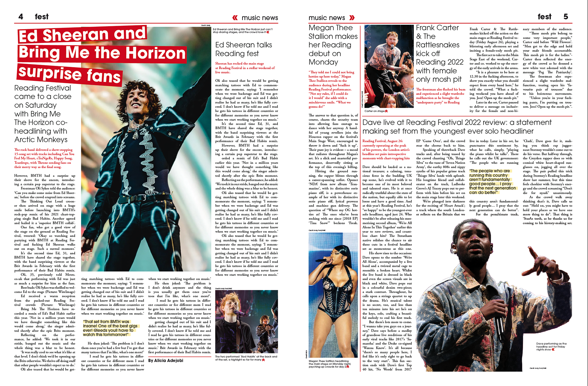
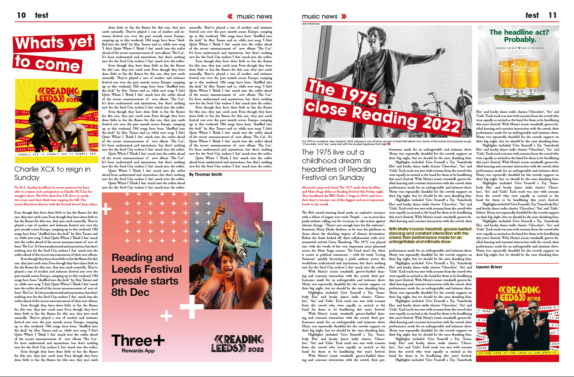
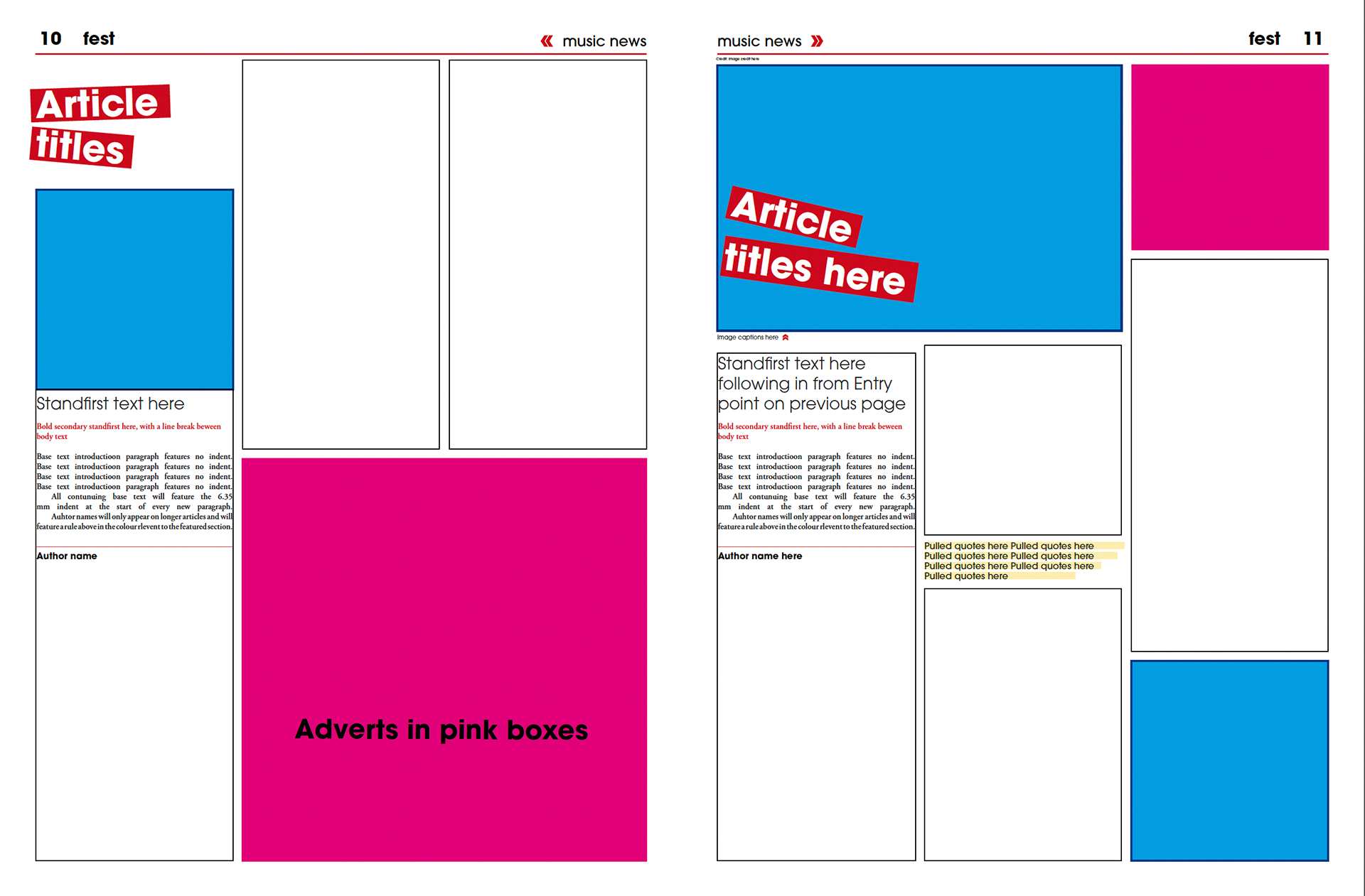
Some more pages from the newspaper showing some more music based pages, handing articles in different ways.
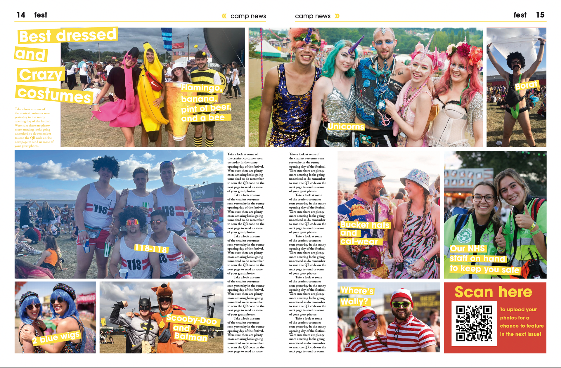
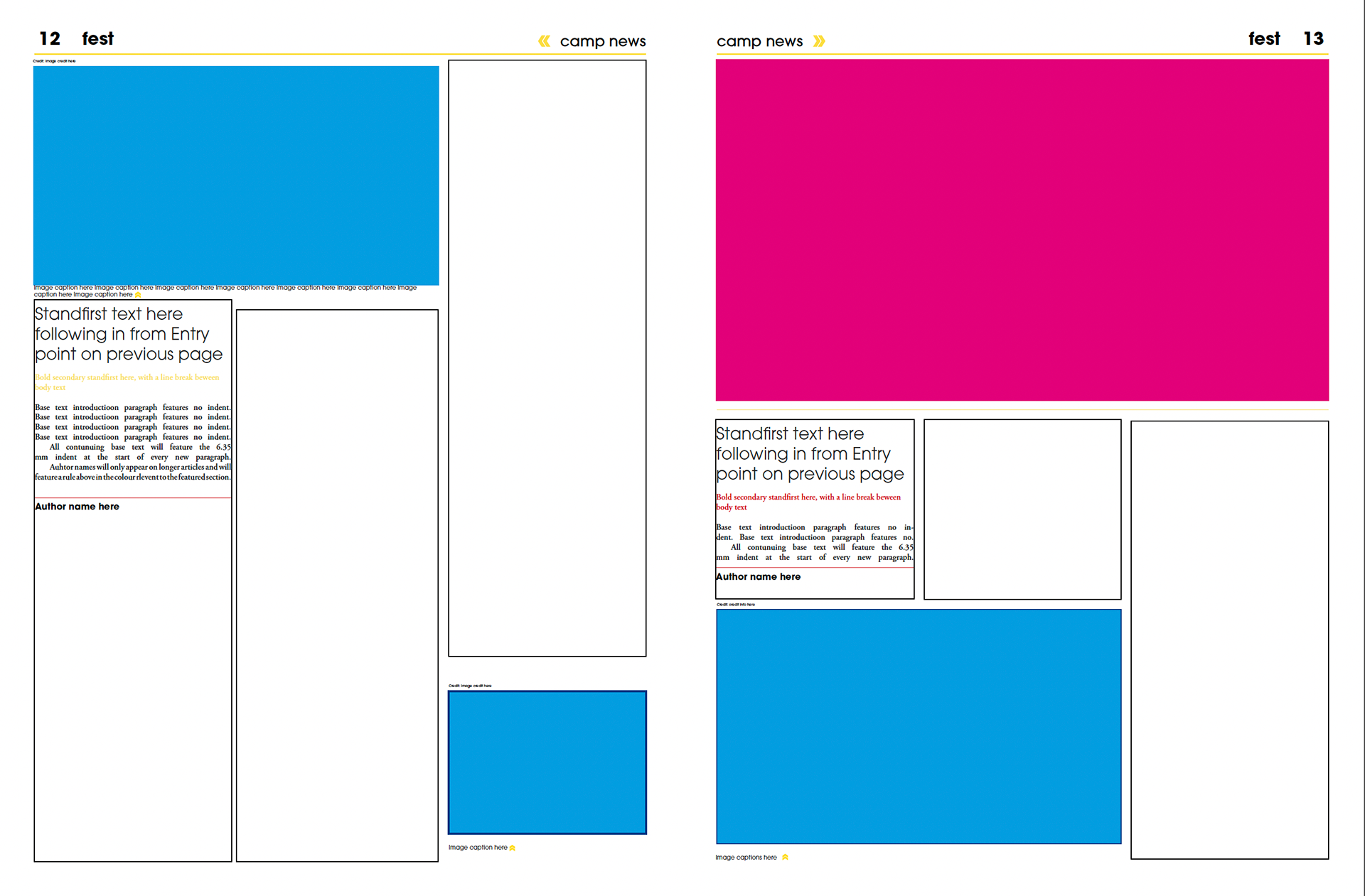
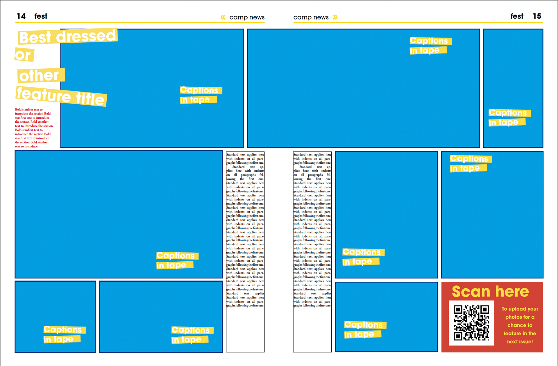
from left to right: a spread showing how multiple articles can be tackled in a page, longer articles with adverts, a camp site photo based article on the best dressed guests in the festival.

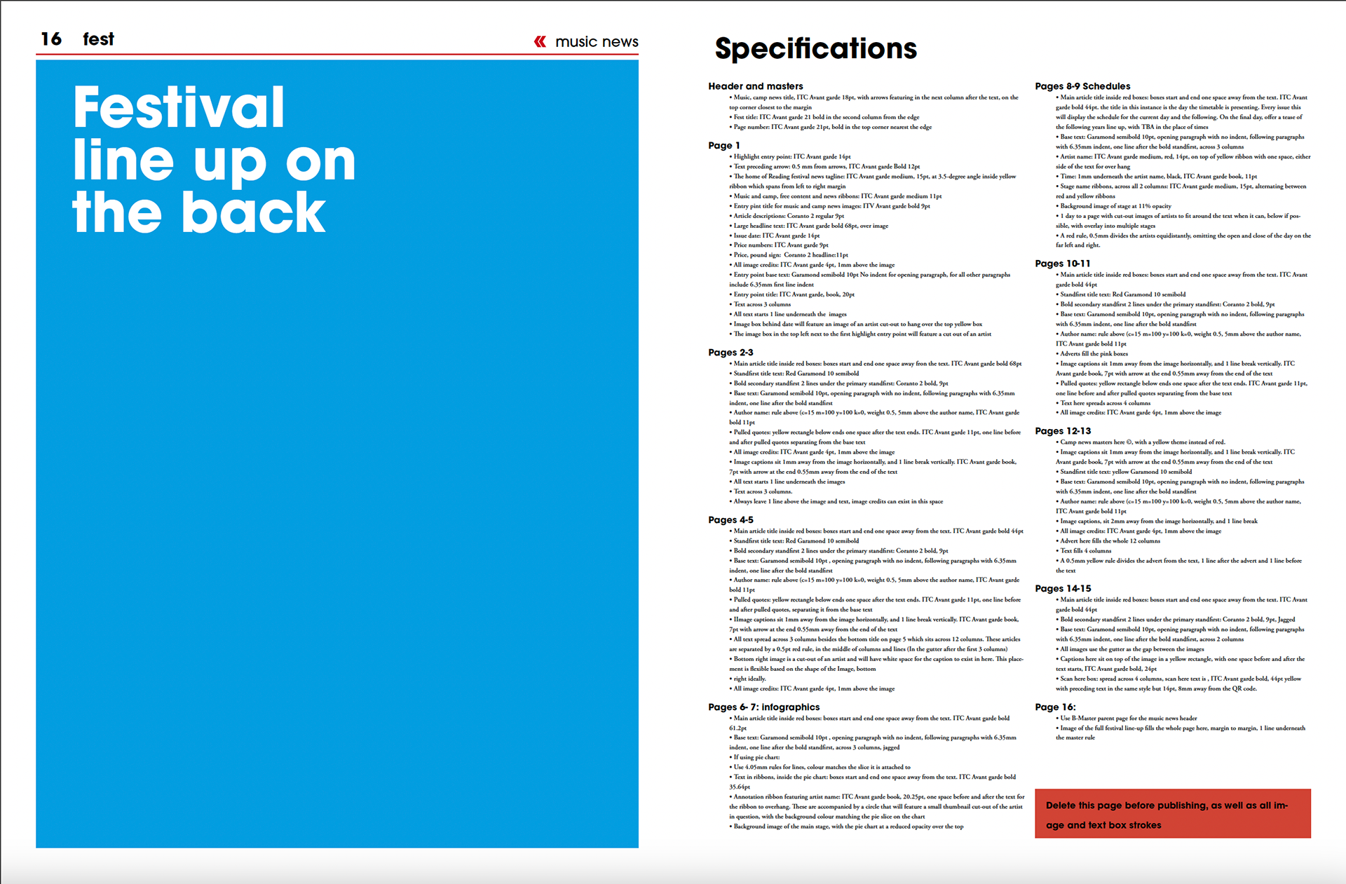
The Fest template, with explanation for what paragraph style to use where, blue boxes are where images will be included.
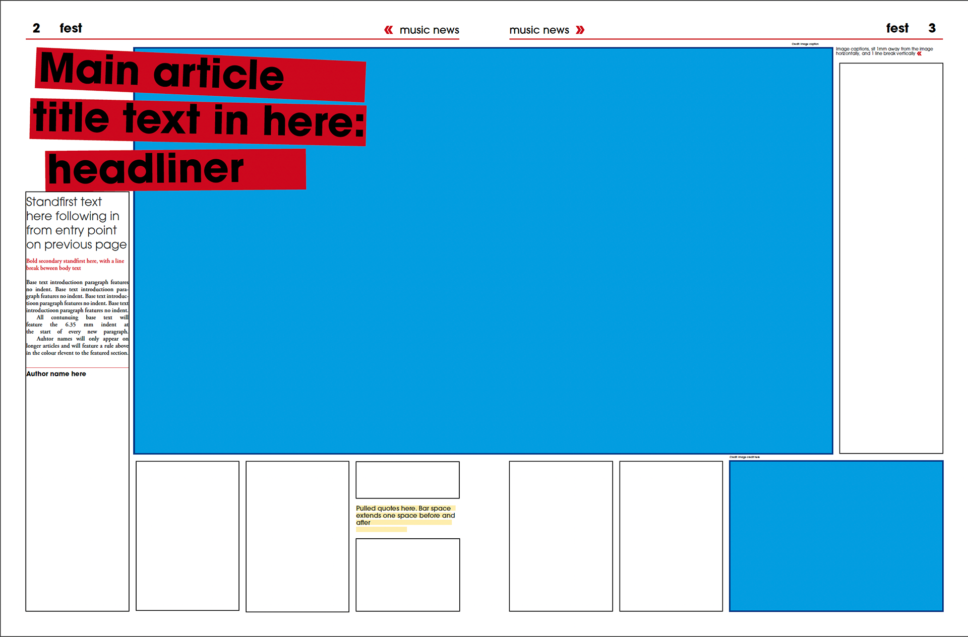
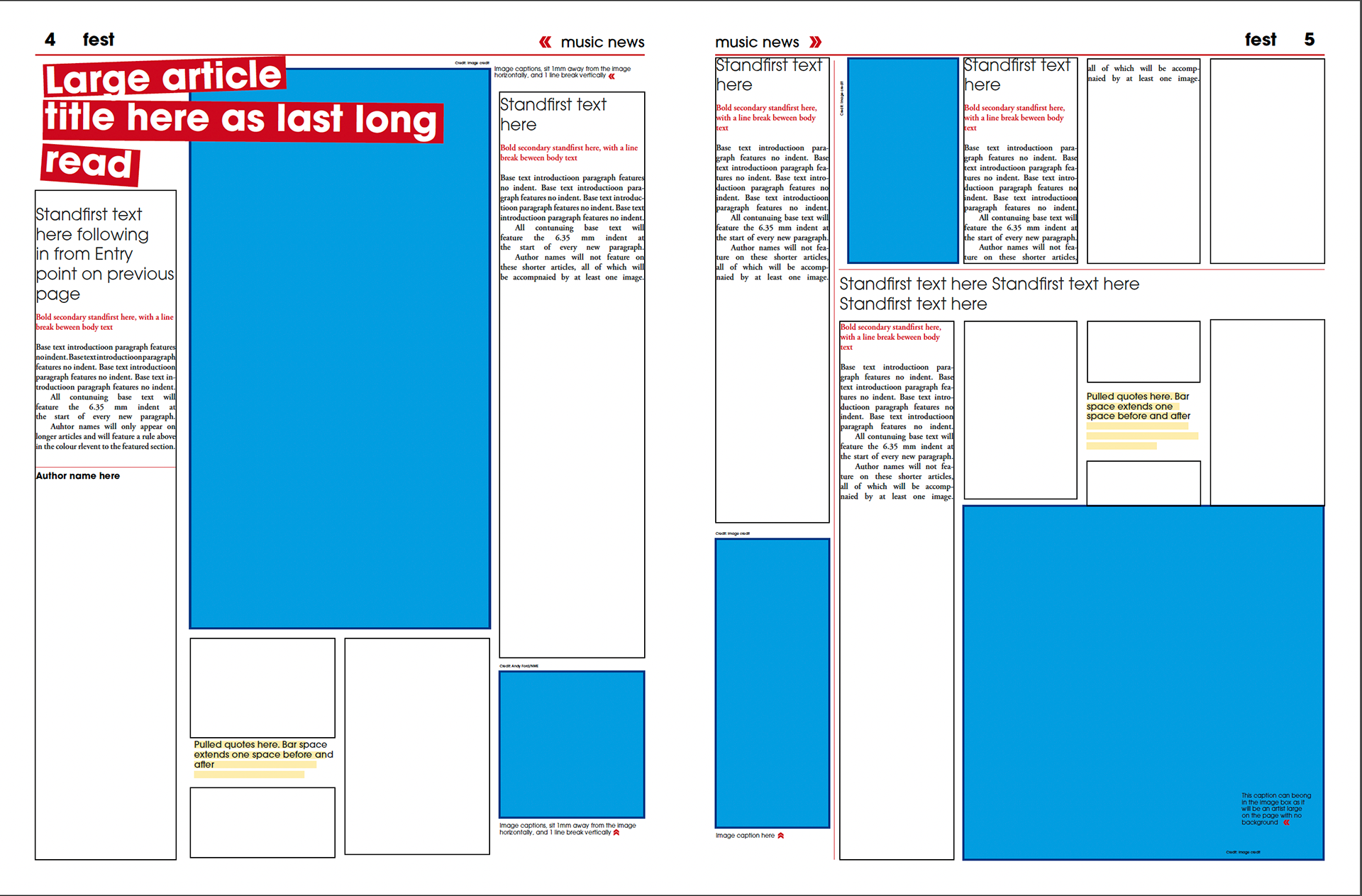
Here are more pages broken down into a template form. The final page featuring detailed specifications page by page.
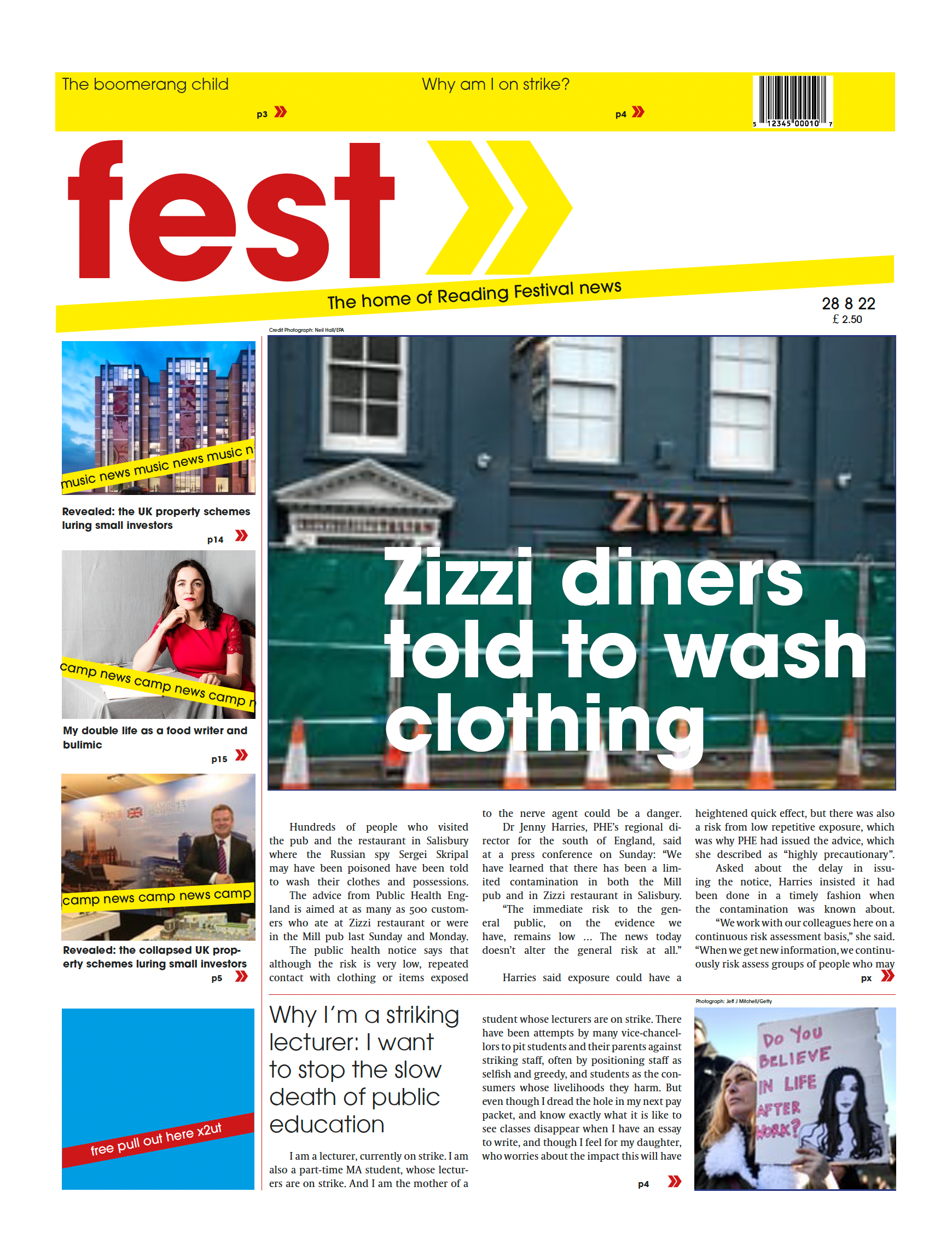
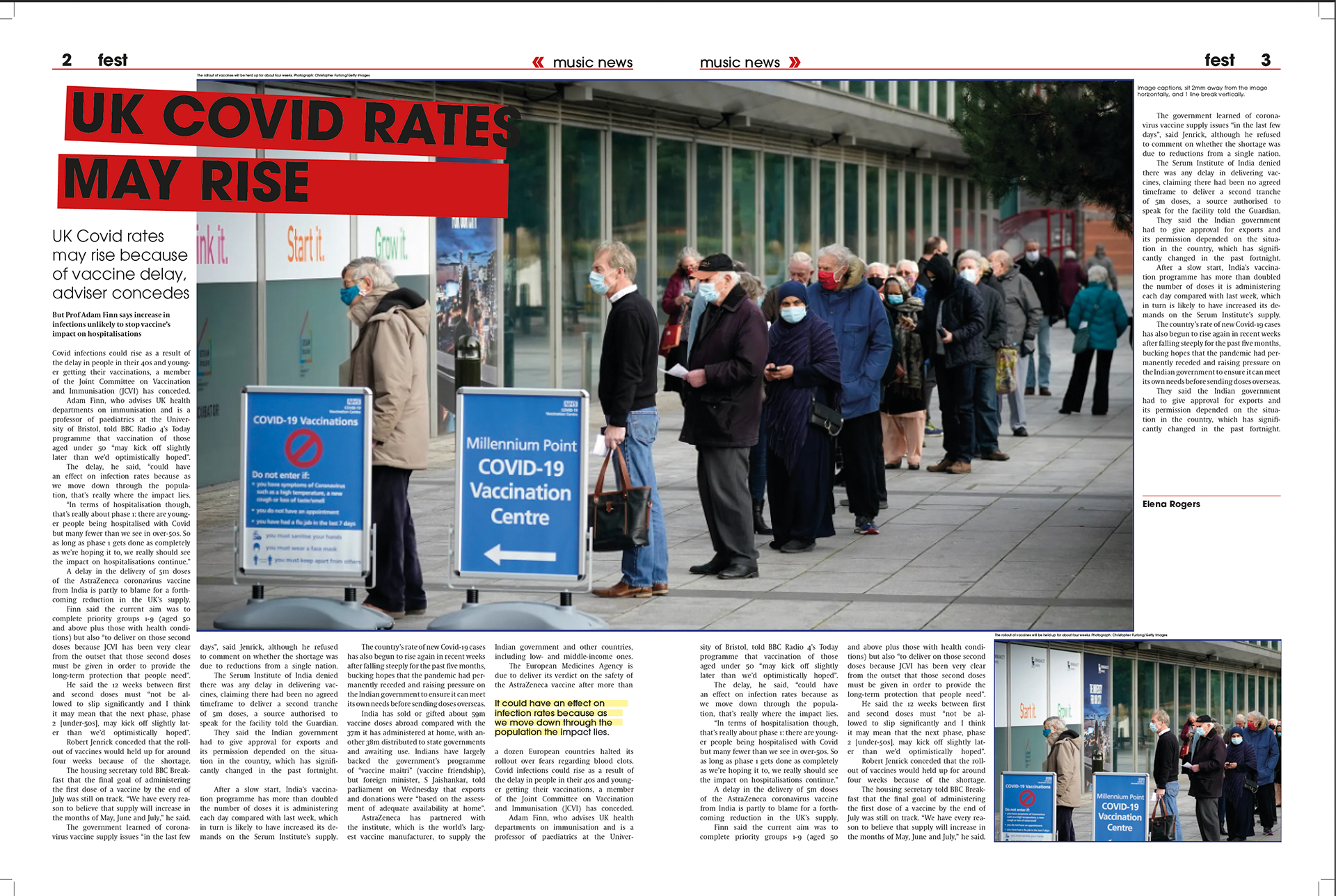
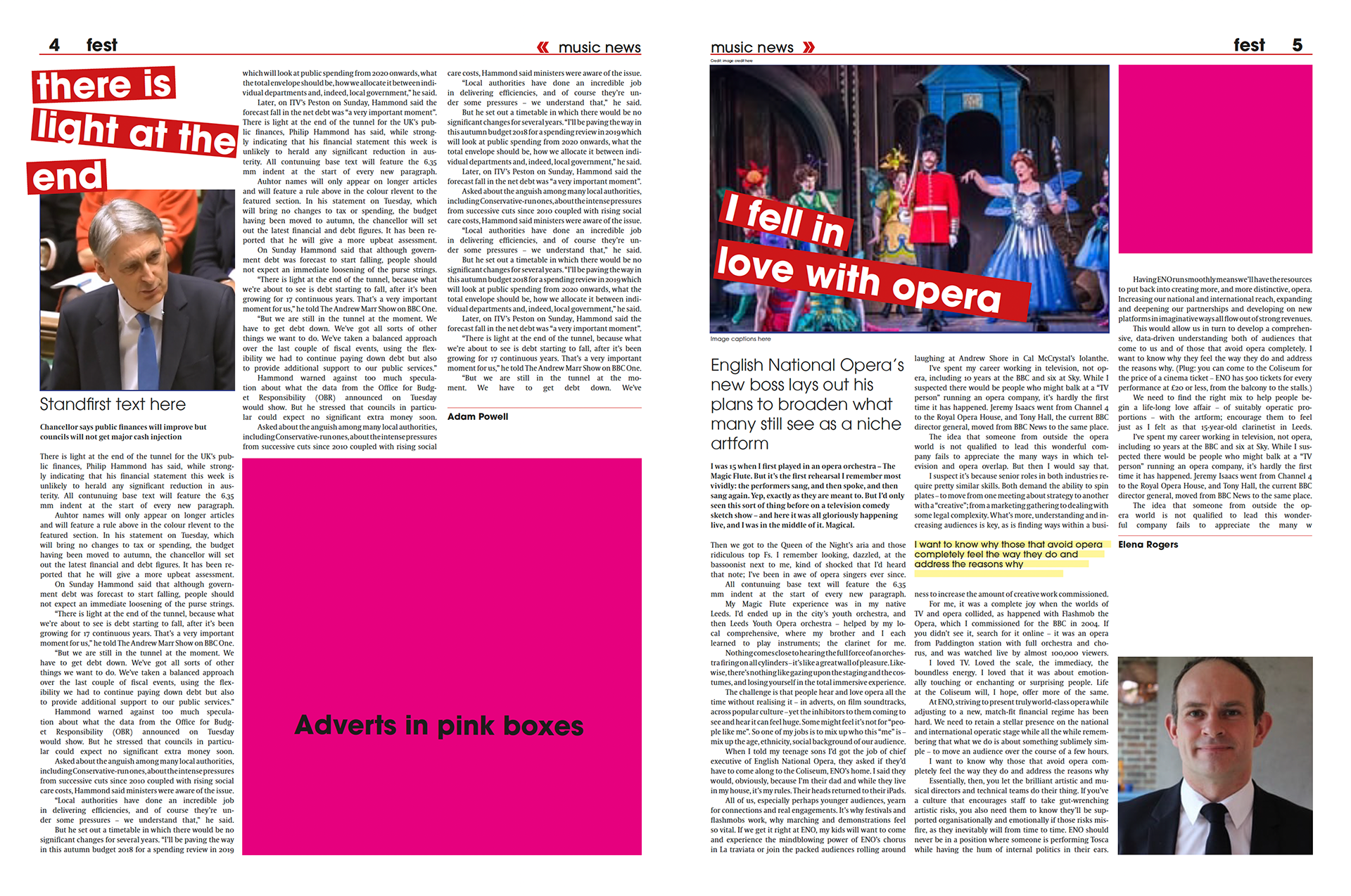
A fellow undergraduate testing the effectiveness of my template, without my assistance to see how well it worked and how easy to understand my directions were. These were the results. She used other existing news articles and images, so it is not a perfect fit, and the news is not suitable for the style I  had established for Reading festival,  yet I am happy with the outcome. Besides a few inconsistencies or mistakes between the both of us, it does the job it was supposed to do.
This was not my only music related project I had worked on this year. Check out some of my work for the rebrand of 'The Prodigy Experience' album HERE 

You may also like

Back to Top