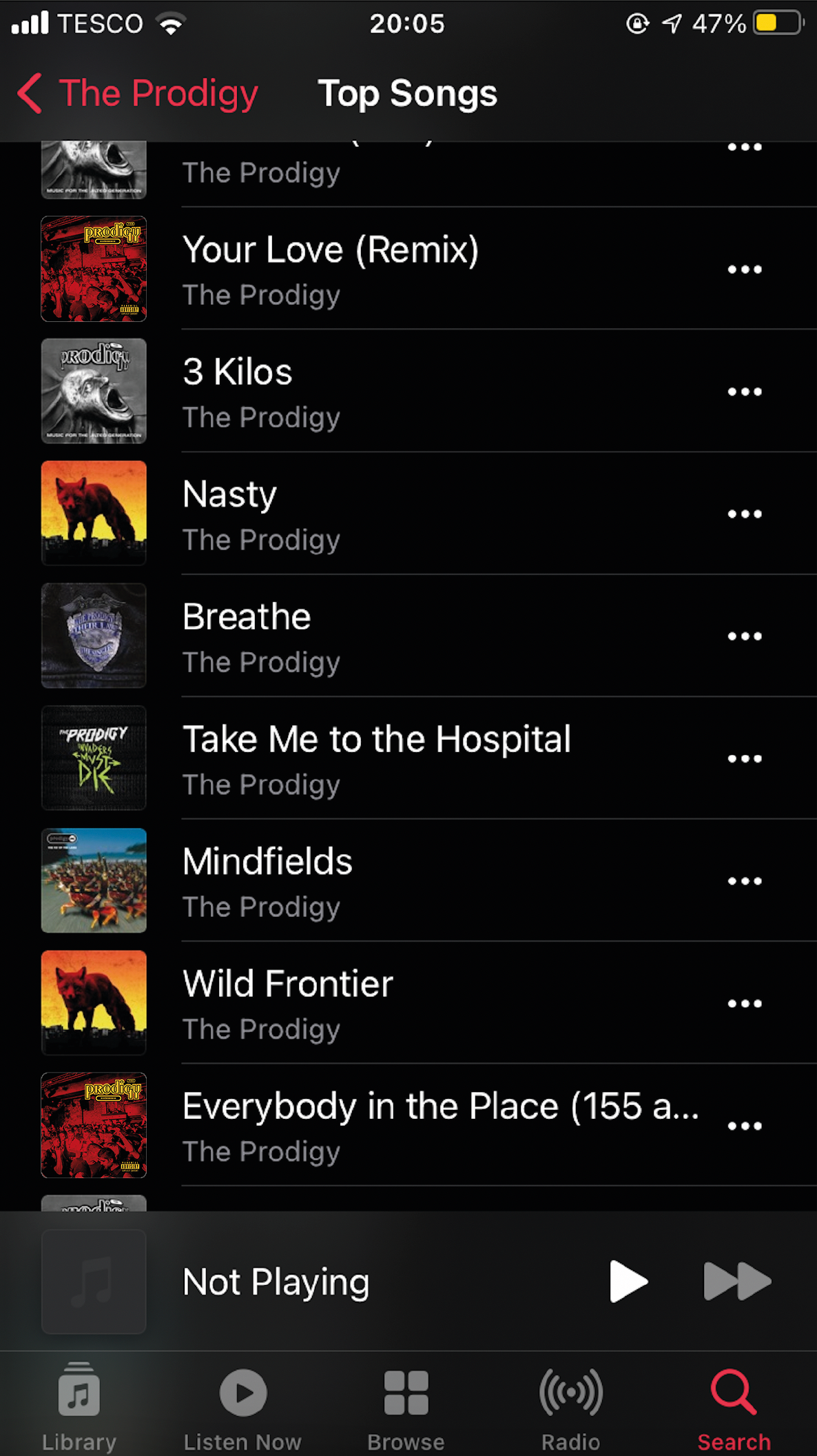
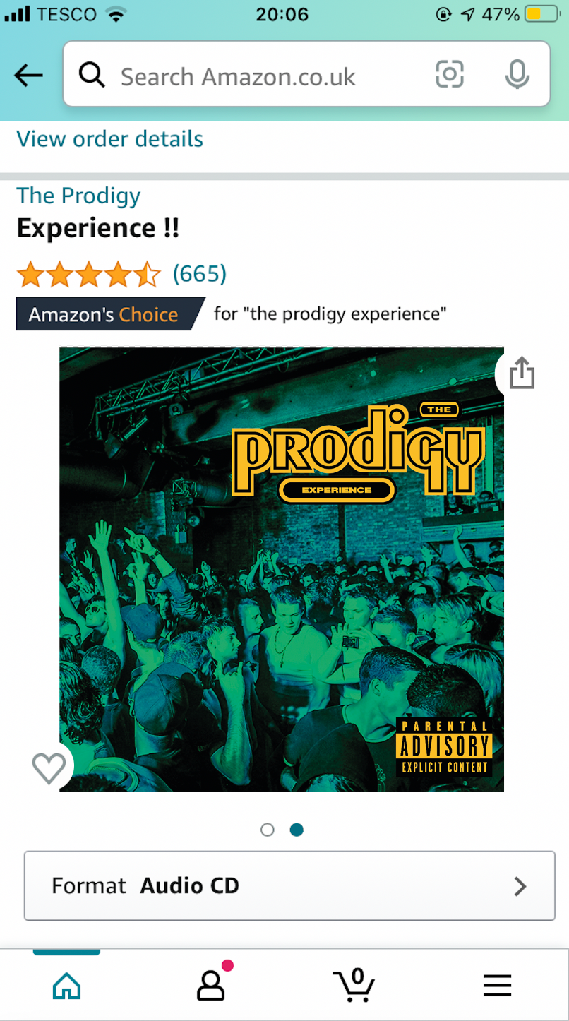
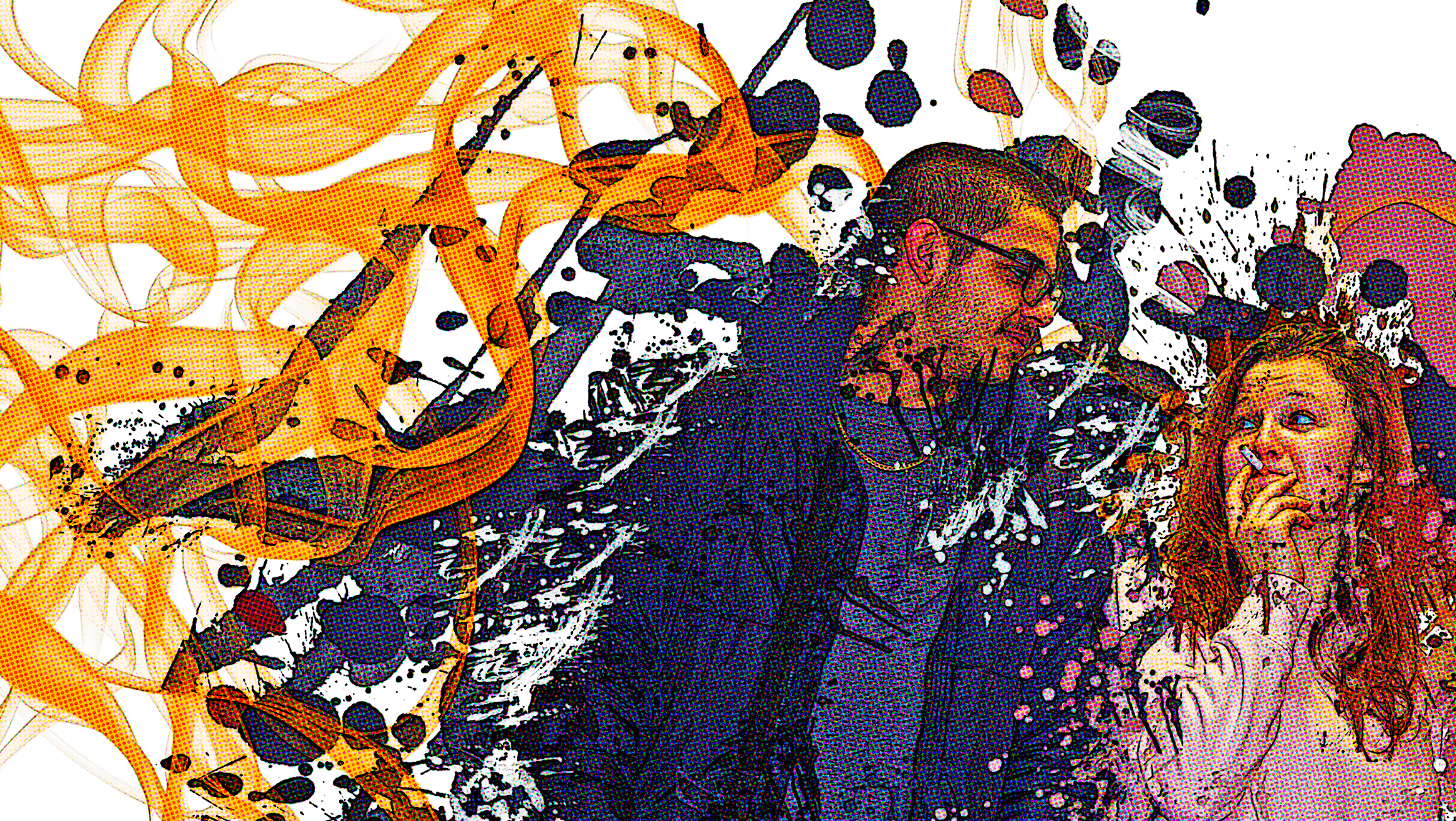
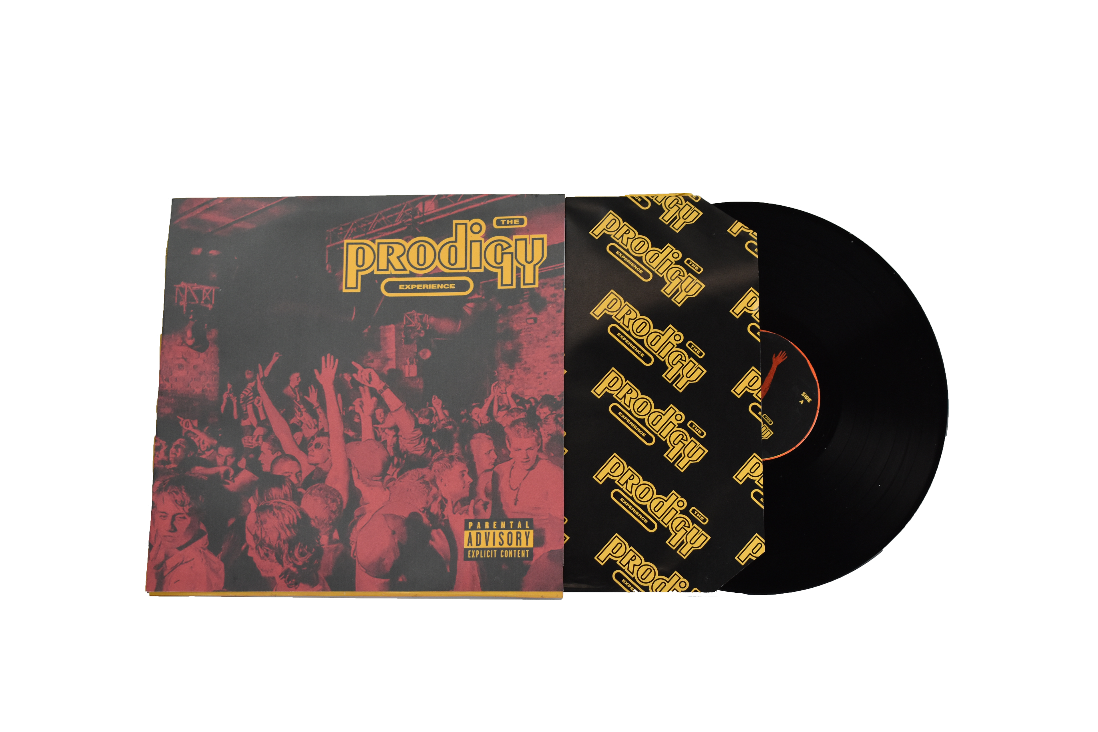
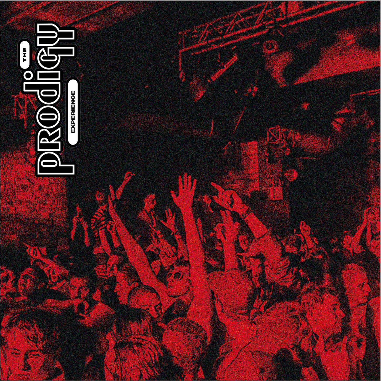
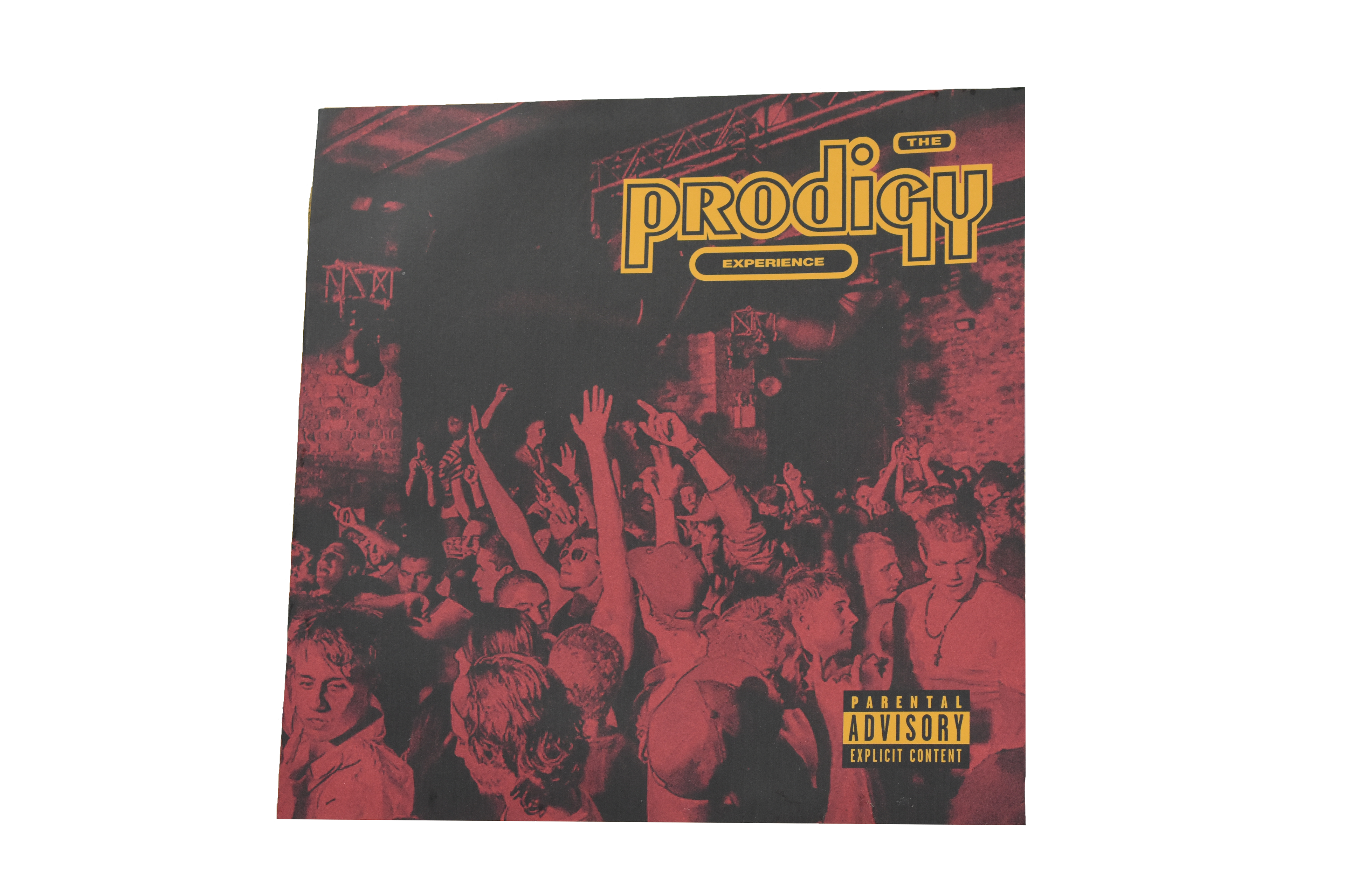
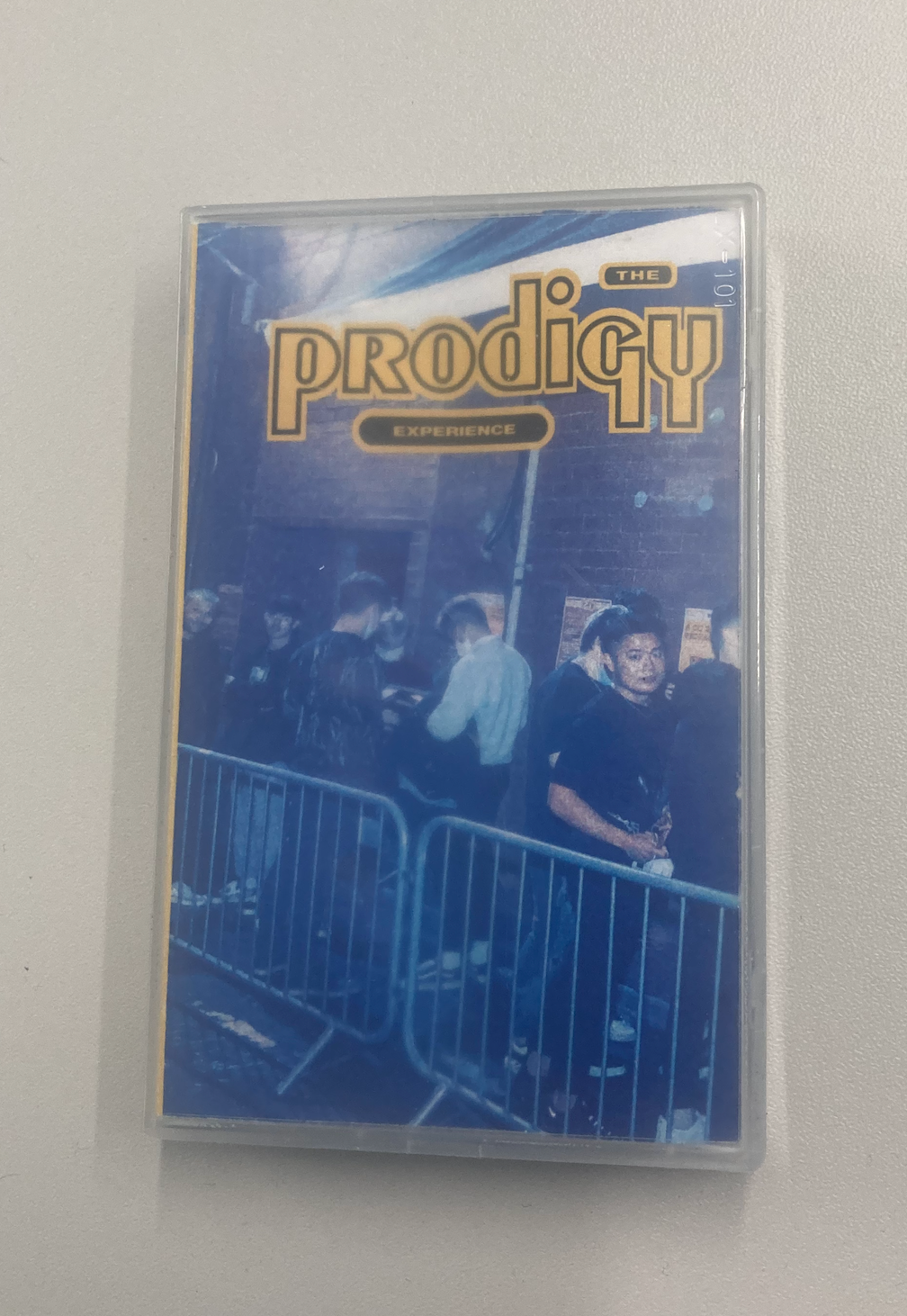
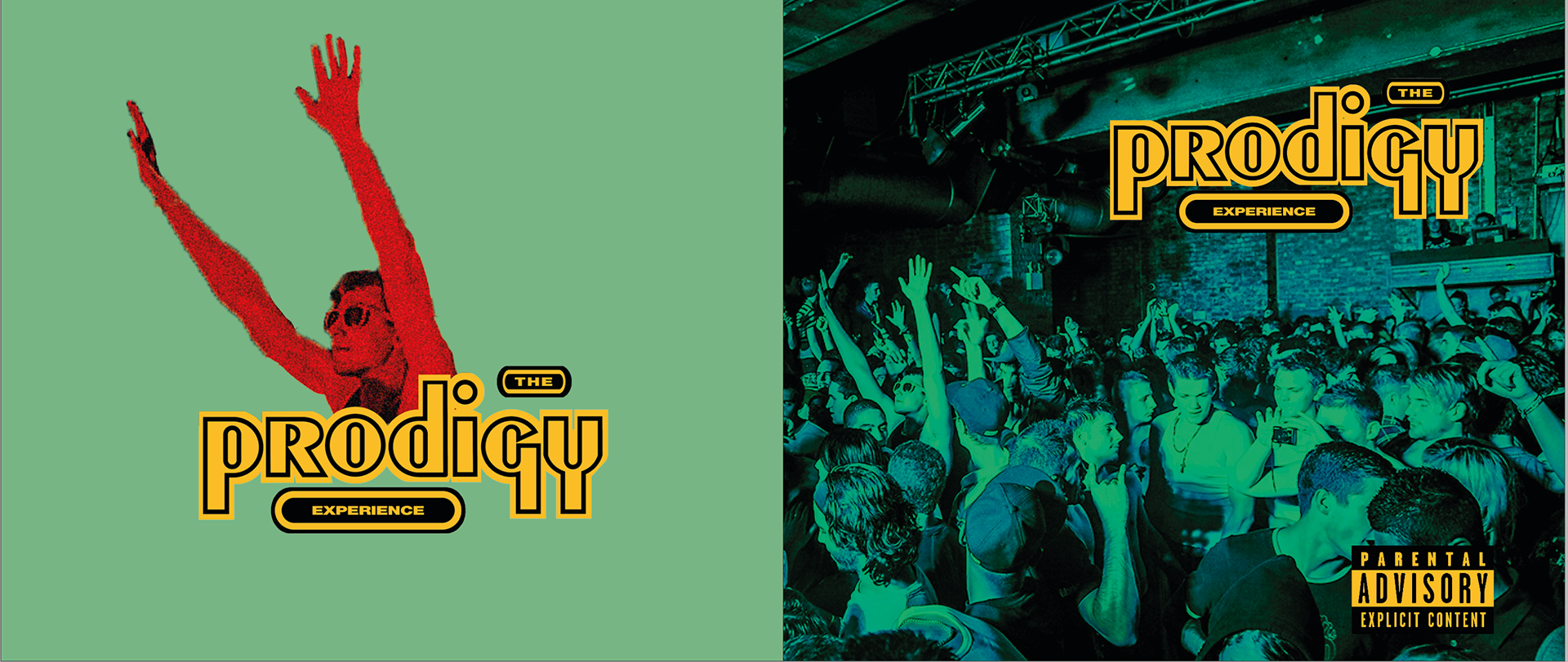
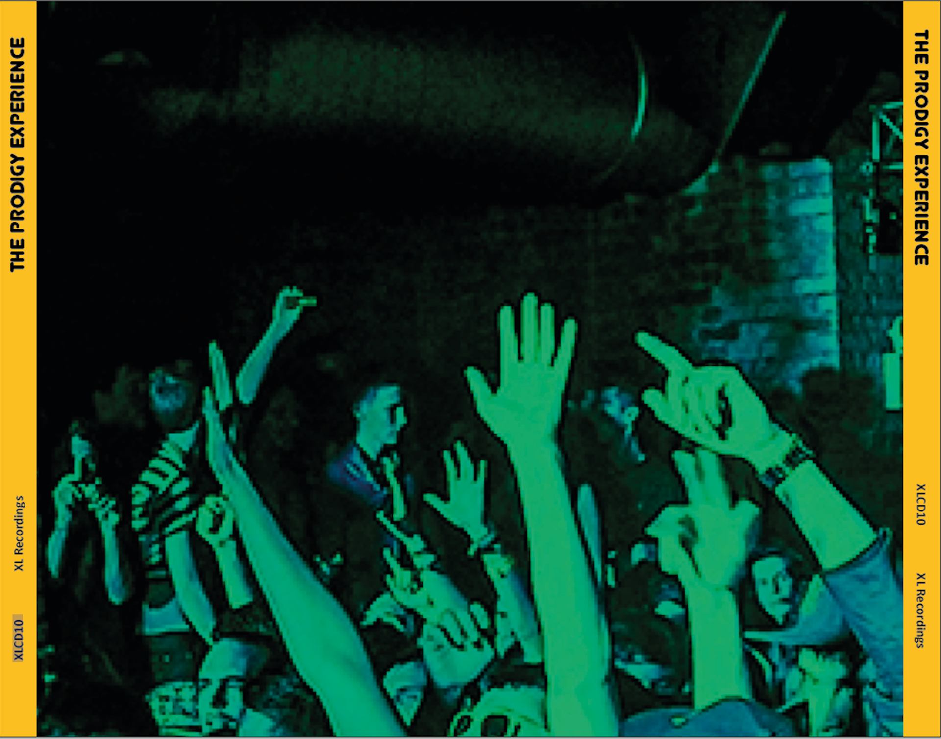
The cover of the vinyl, emphasising a grunge 90s theme with film grain and a clubbing atmosphere.
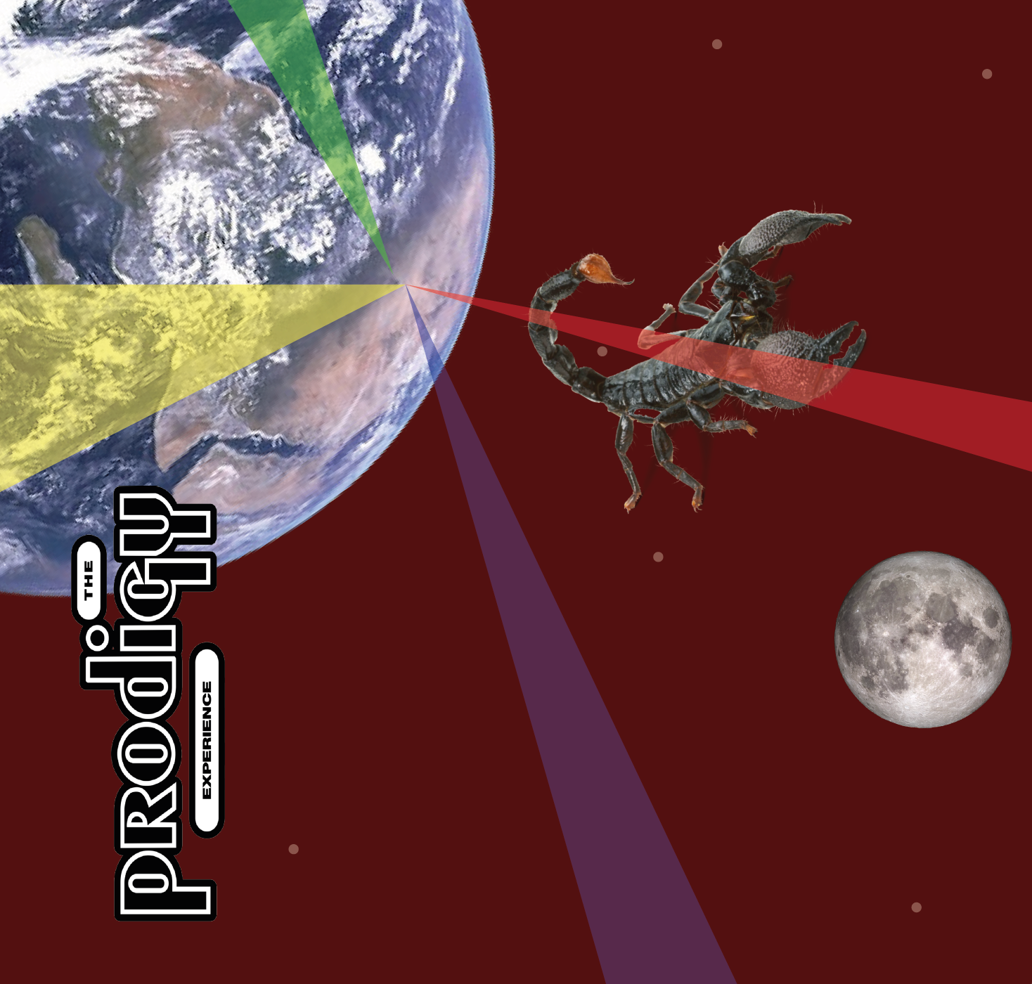
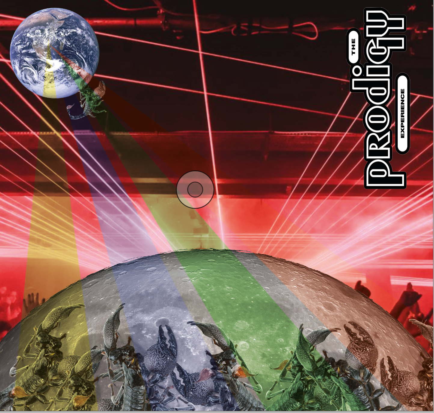
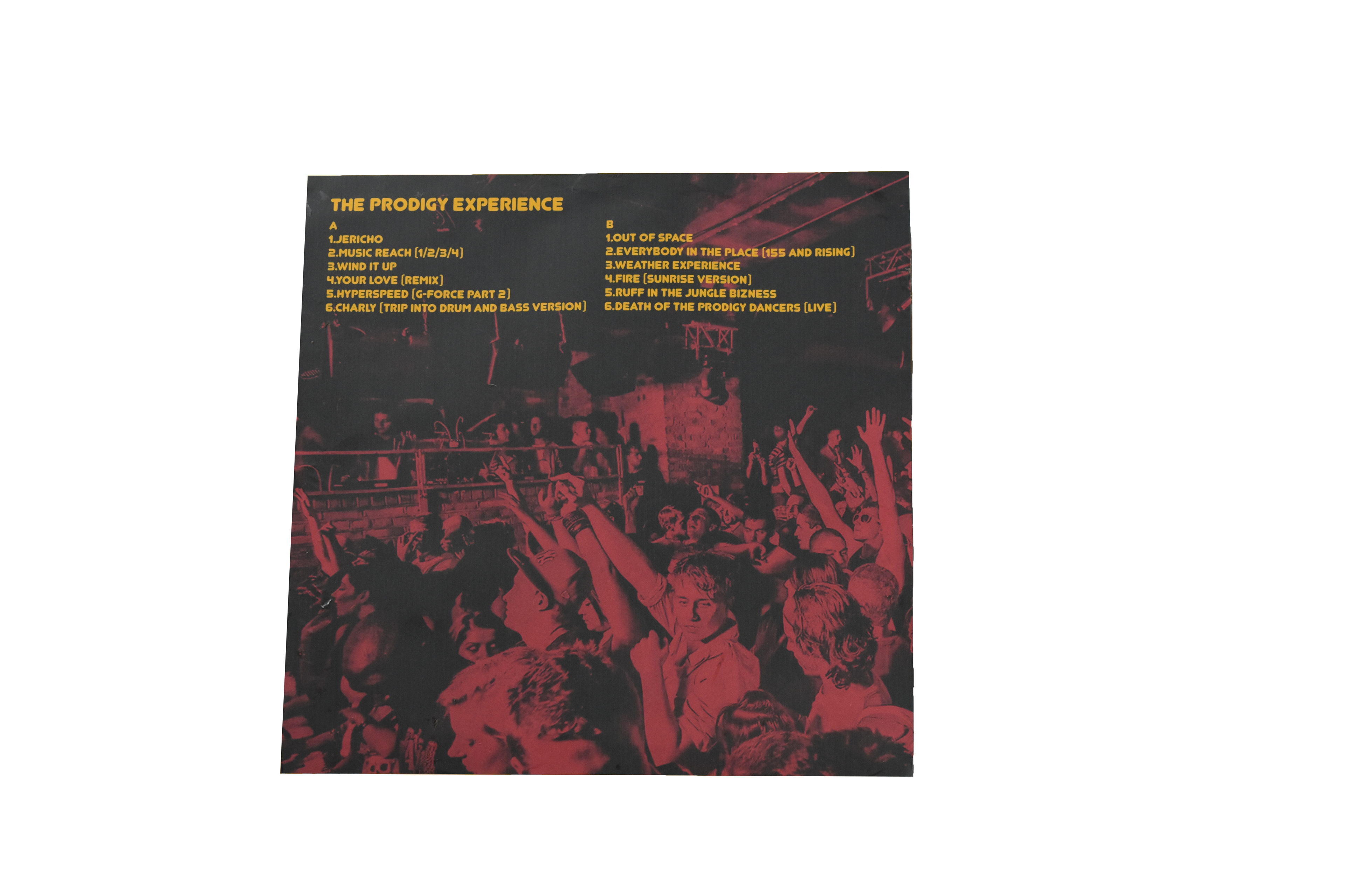
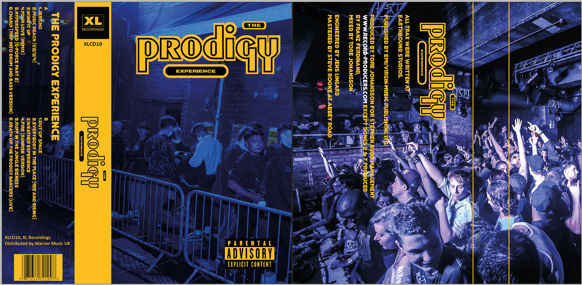
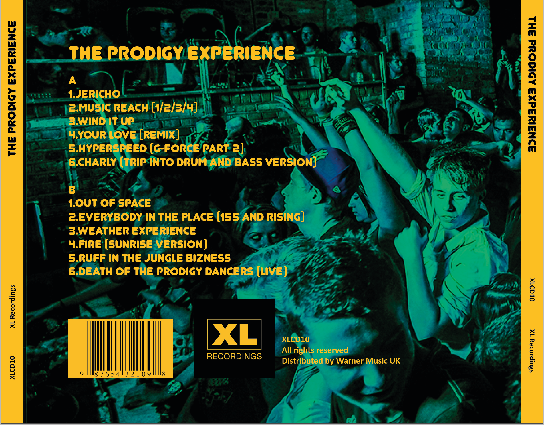
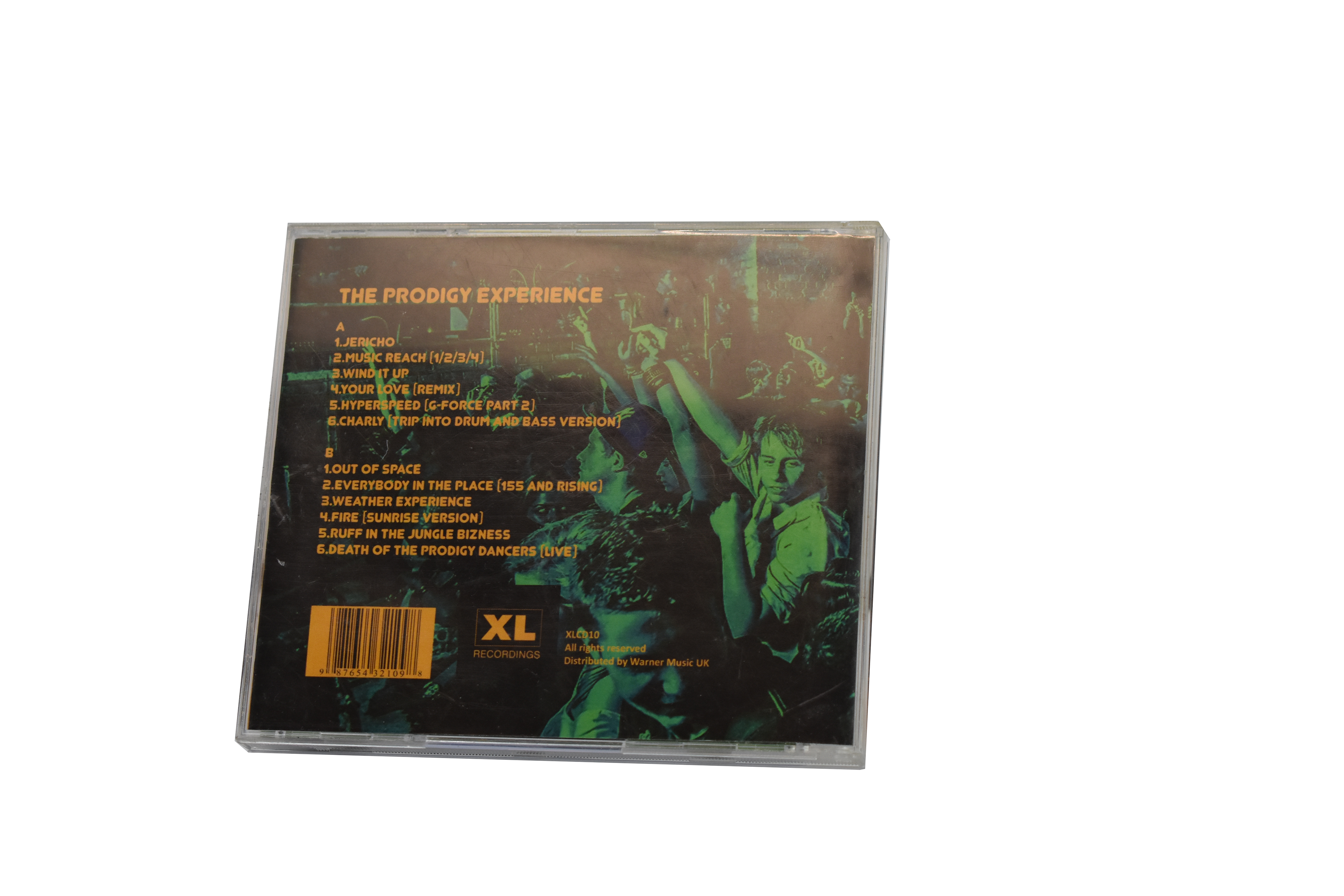
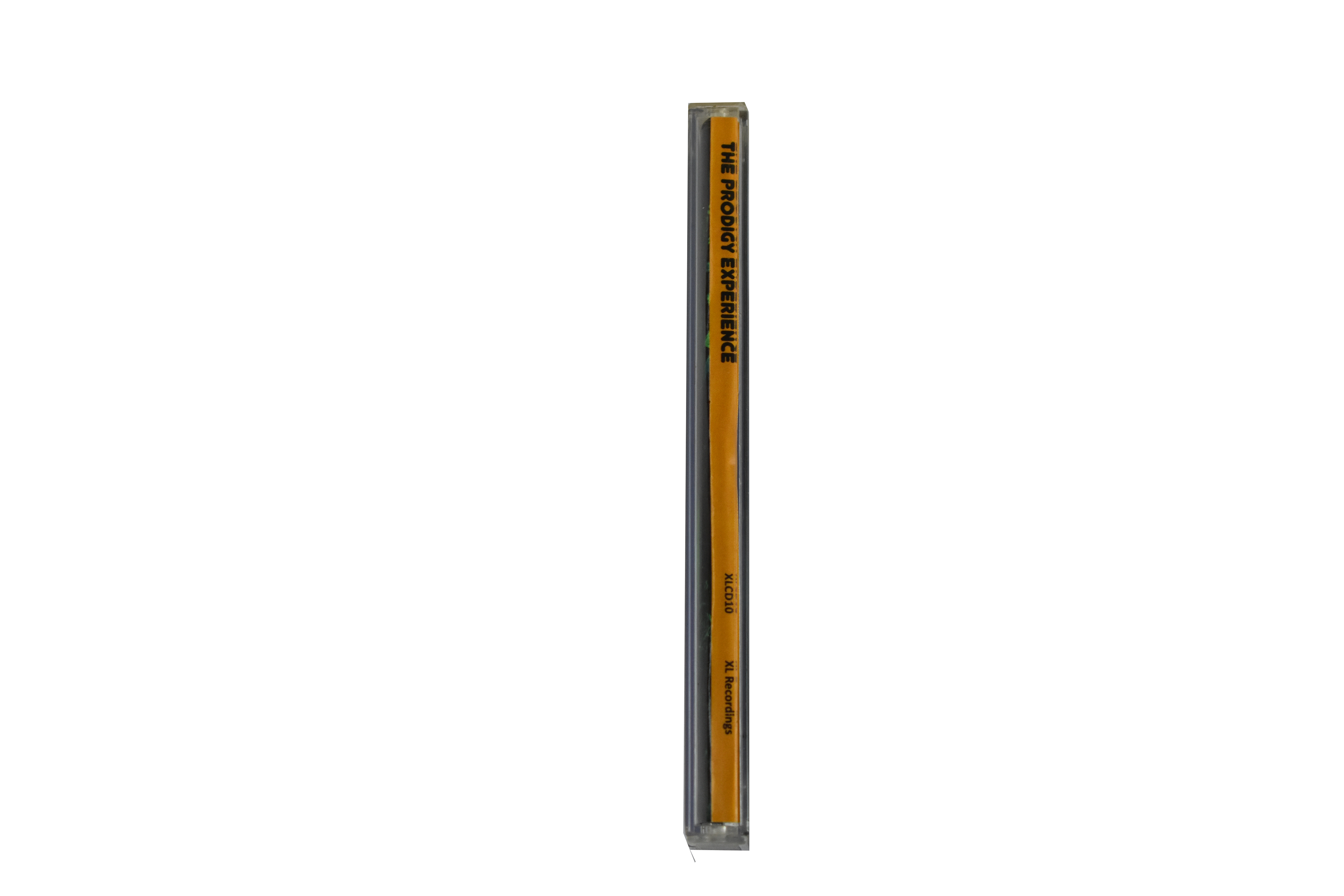
The entire vinyl spread including spine and back cover, the spine was separated by yellow spray paint to hark back to some urban origins with graffitied walls in underground bars and clubs. This would be part of the colour theme throughout, with a Prodigy signature red being the primary colour.
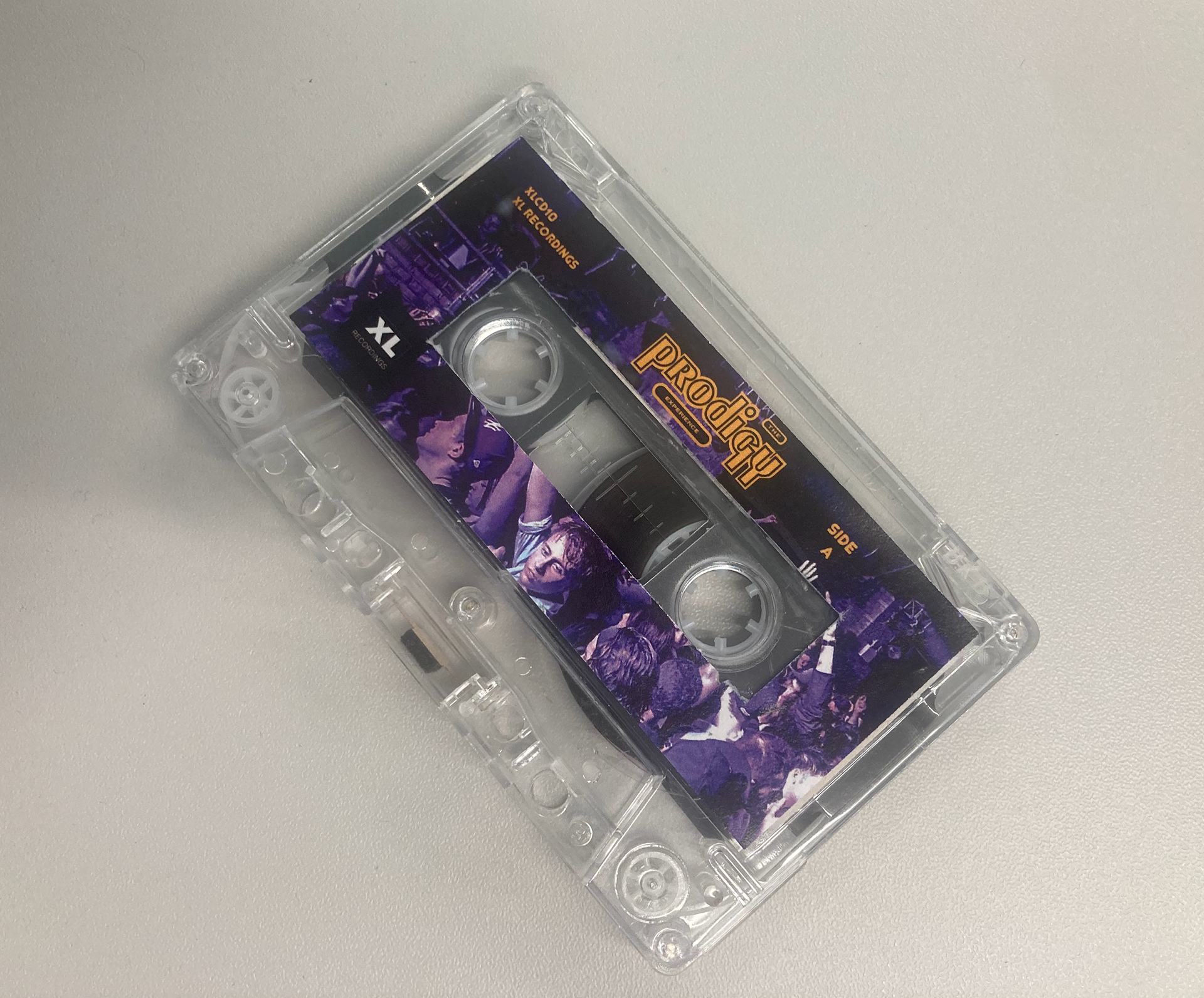
Below from left to right; The sticker for the vinyl itself, features one singular clubber, with the energy this main displays, the clubbing sensation is not lost with the omission of a dance floor and crowd
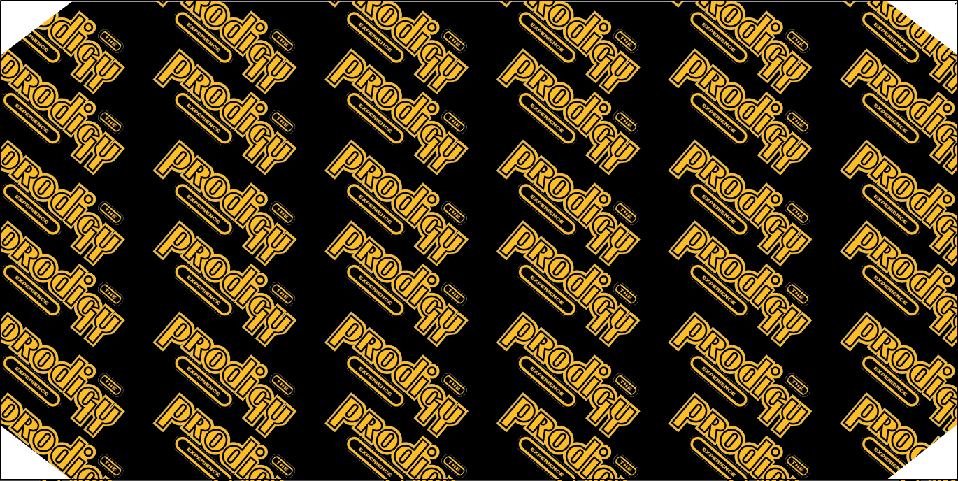
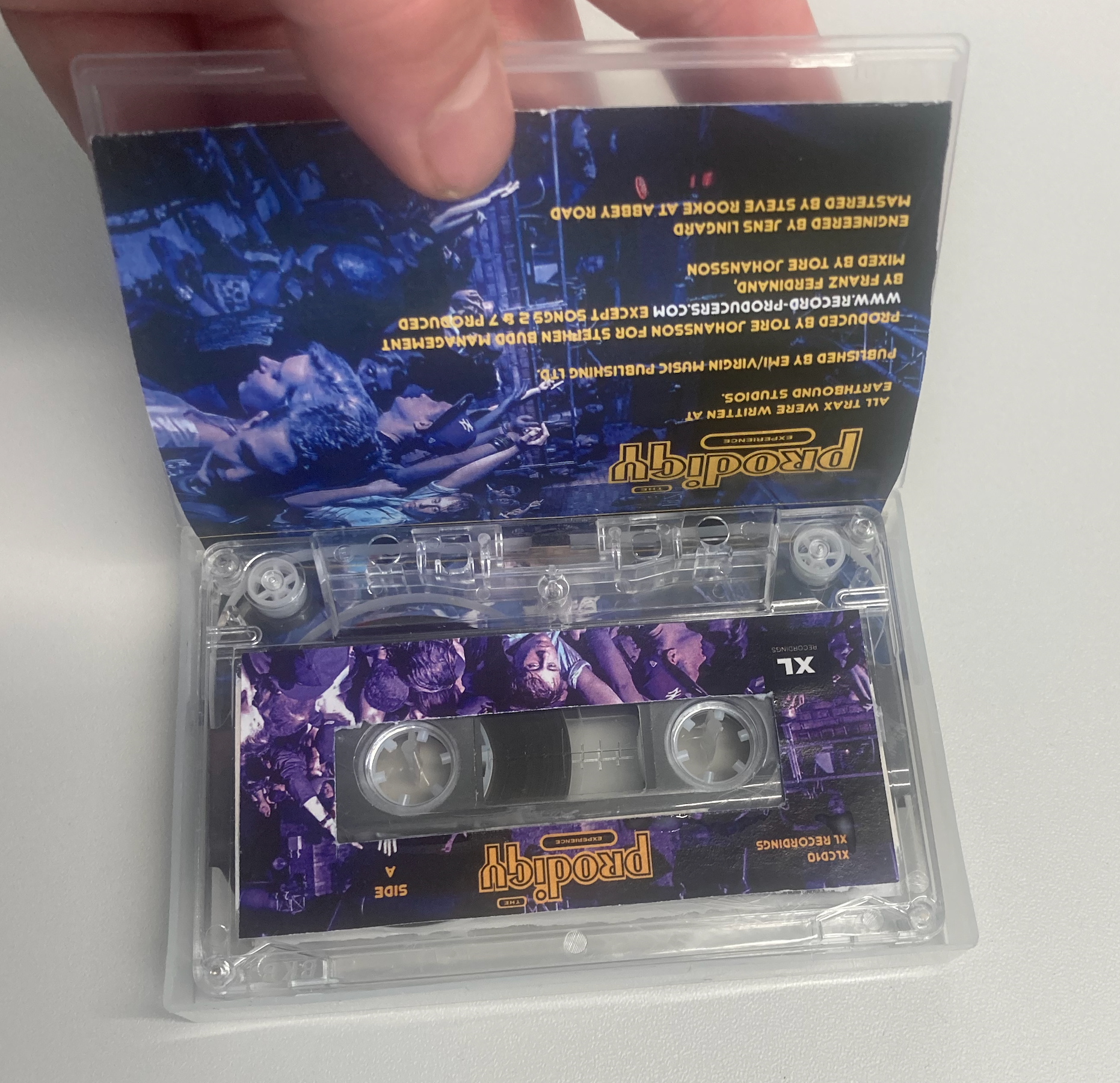
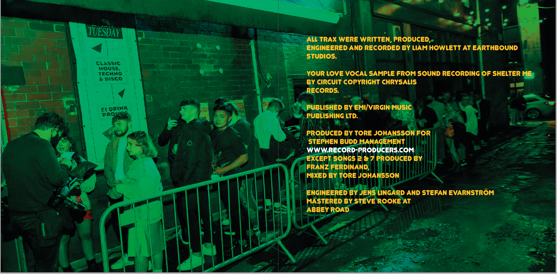
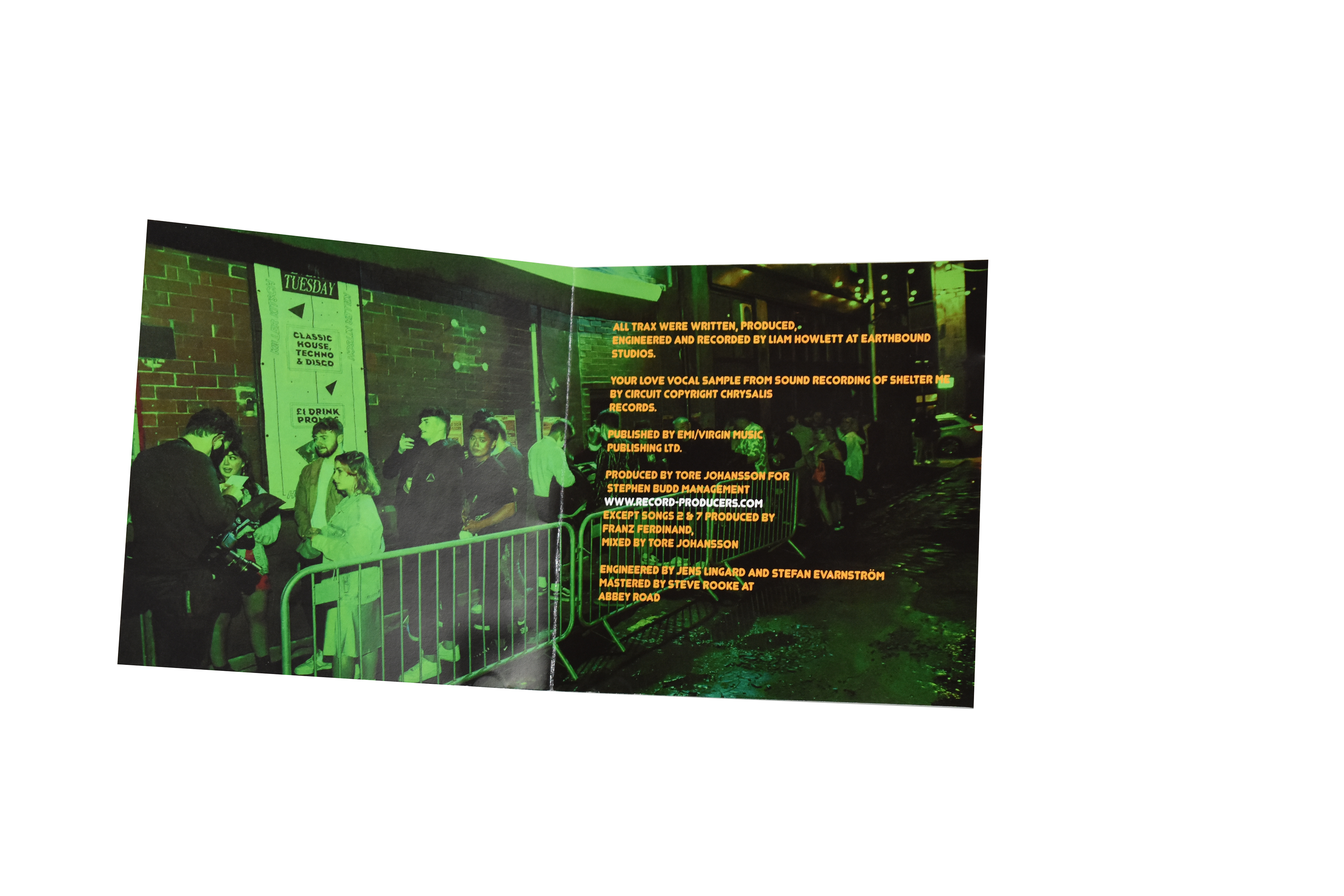
The inner sleeve is all yellow to break up the continuous red throughout the packaging, with The Prodigy logo repeated consistently , reflective of the rhythm put forth in the bands music
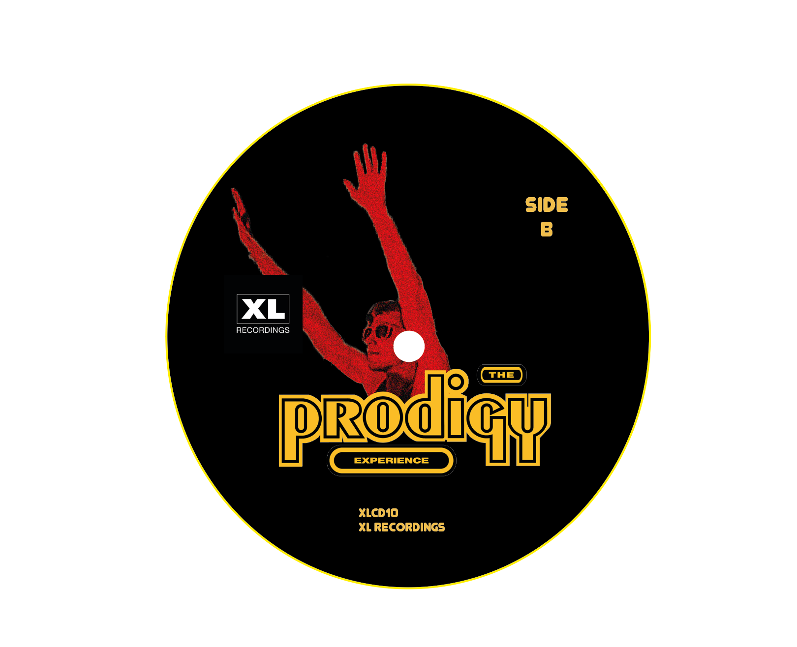
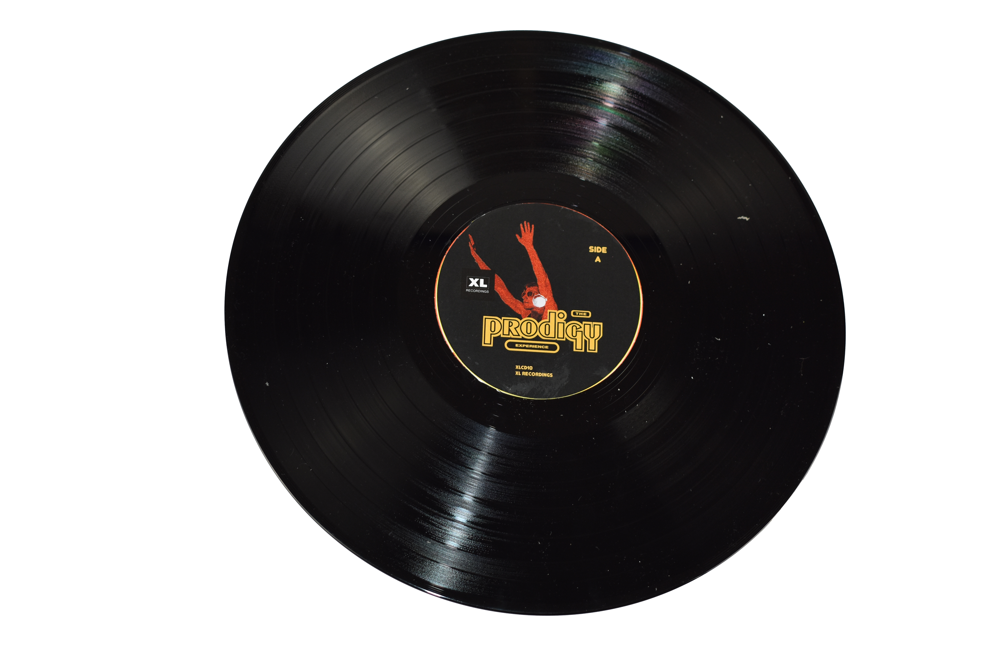
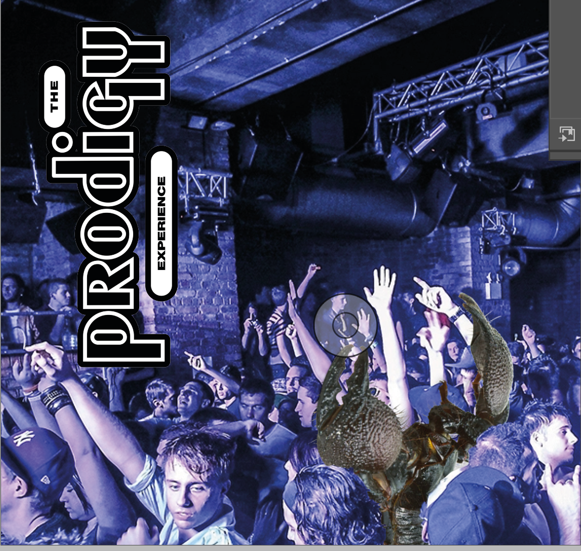
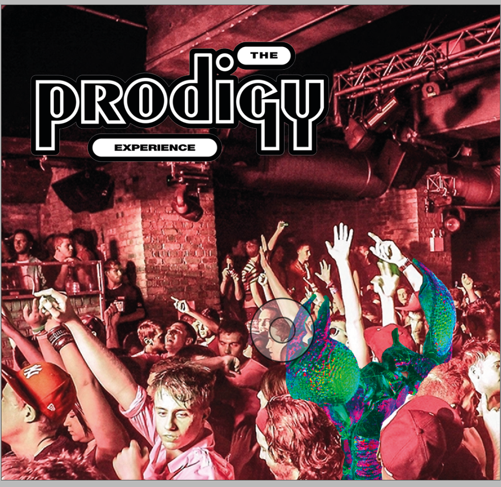
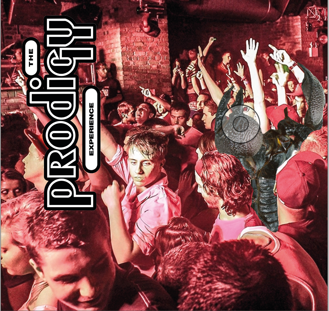
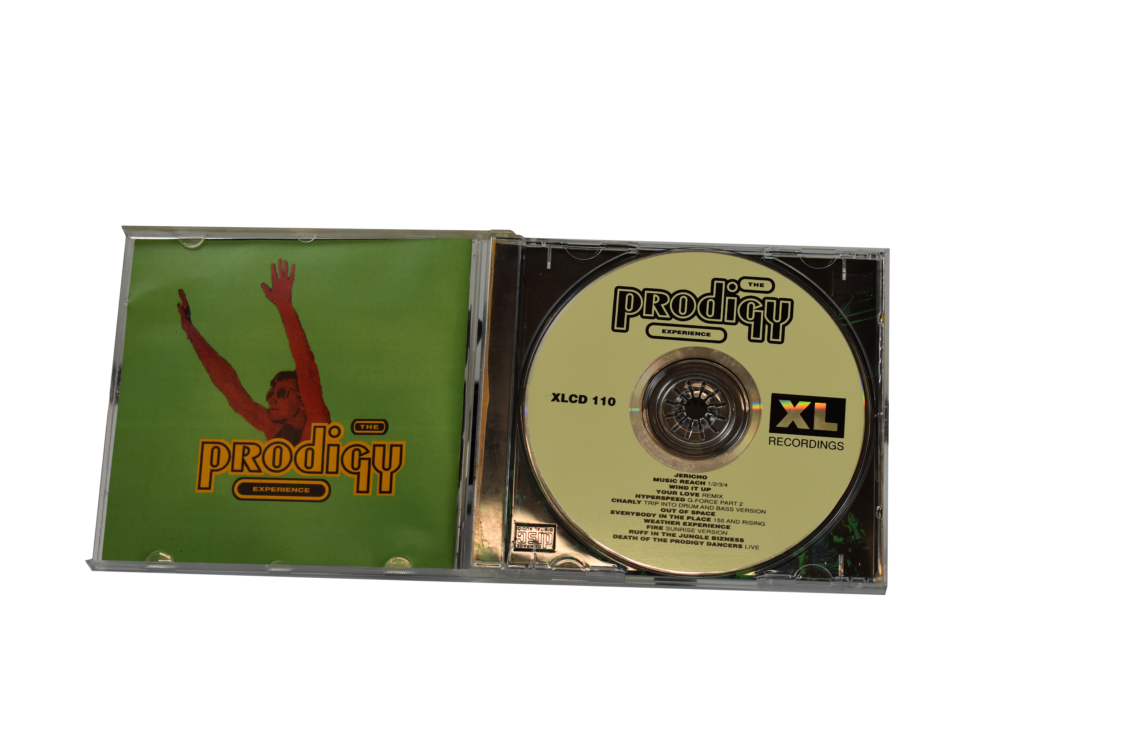
This is an unused poster I developed for the promotional campaign, with a design taken from the vinyl sticker, this was an experiment to see if the man clubbing, could be a suitable mascot replacement for the scorpion. It didn't seem to emulate the chaos of The prodigy's brand for me, and was consequently dropped.
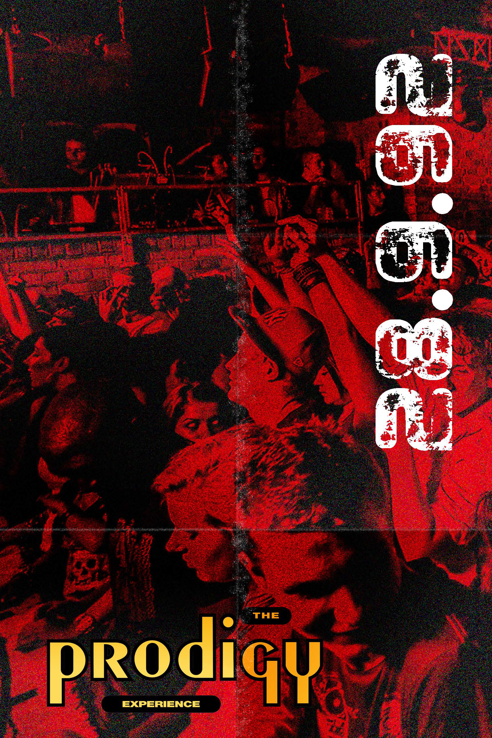
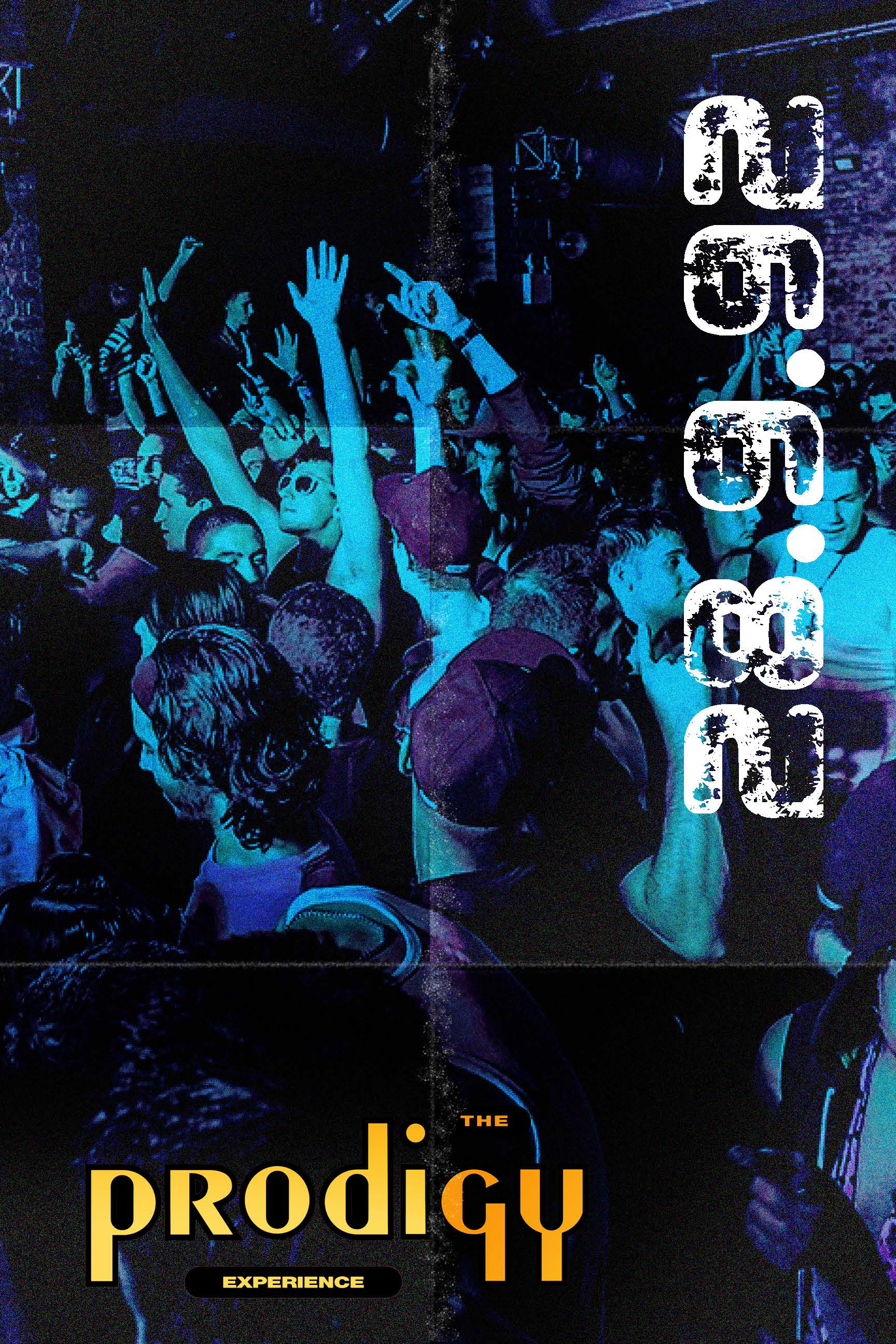
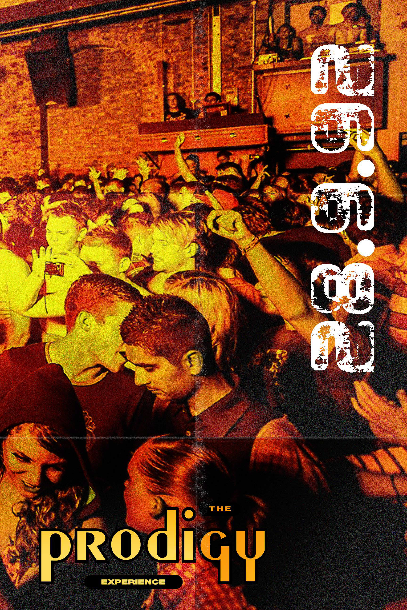
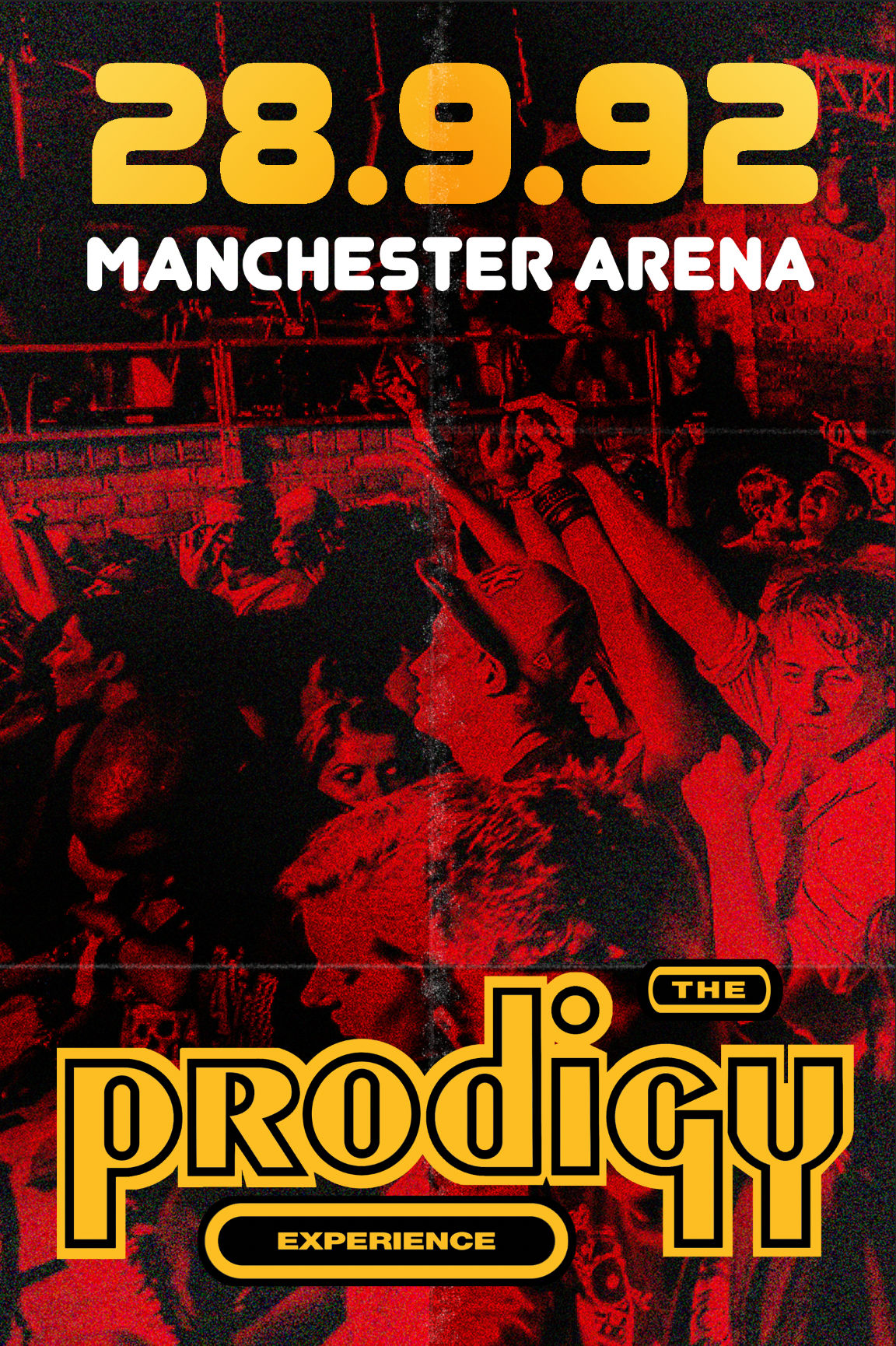
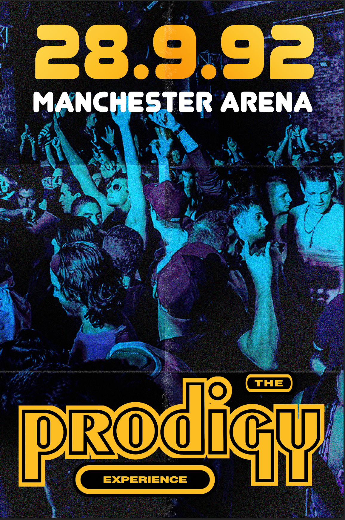
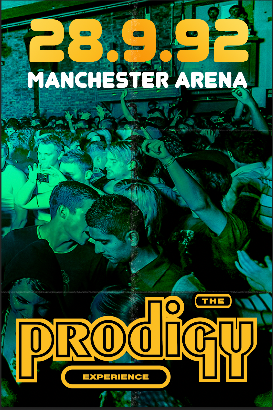
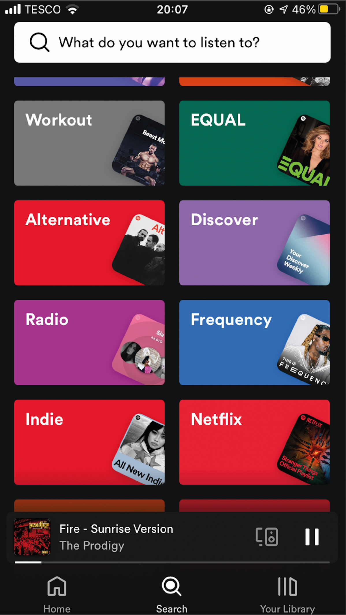
The album artwork displayed when the user is listening to it on a music platform such as Spotify (seen above).
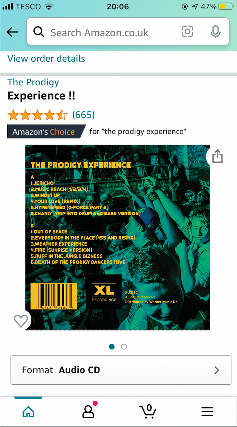
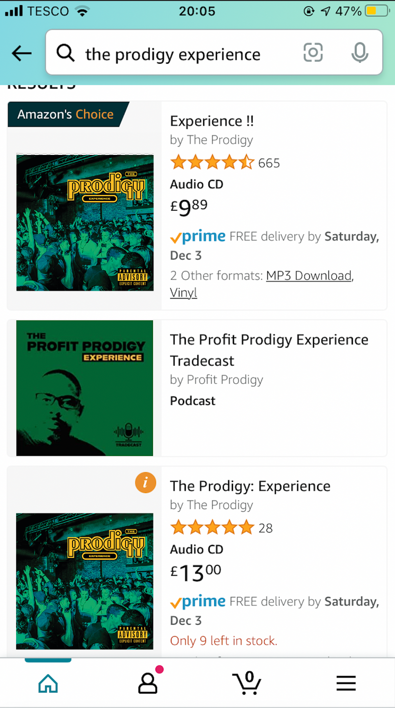
Below from right to left: the artwork amongst the other albums in The Prodigy library on Apple Music, when the song is playing in thumbnail view, on Amazon, front cover on Amazon and back cover on Amazon.
